The challenge
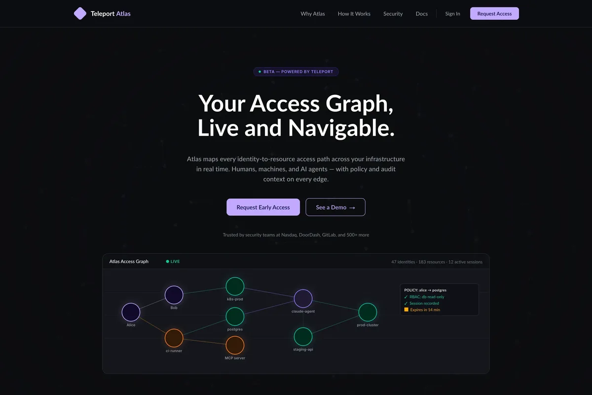
This project was a coding challenge from Teleport during an interview process. Most of what I’ve built recently has been Swift applications, one-off WordPress plugins, and this portfolio site. This is the first third-party project I have built with AI tools like Claude. Teleport gave me a Figma of their Atlas product landing page and told me to build it in whatever front-end technology I wanted, then present it to the hiring panel. Because it was a challenge, I was given permission to publish the code, so the full source is public on GitHub and the build is live at teleport-atlas.vercel.app.
Experimentation phase before buildout
I generated a Figma personal access token and pulled the design down as JSON through the Figma API, then handed that JSON to Claude Code to see whether it could build the page from the raw design data alone. The fonts, layouts, and spacing all came back inconsistent, and I dropped that approach the same day. I went back to a hybrid of my usual manual build and a row-by-row collaboration with Claude, going section by section down the page. That got me from nothing to a built page with working product animations in about twelve hours.
Foundation and architecture
To get the base of the site set up, I used the Figma JSON to pull every design token I needed into variables for the colors, the spacing, and the type. The two typefaces, Lato and Inter, are open fonts, so I grabbed them from their sites and self-hosted them, loading the WOFF2 files locally instead of pulling them from a third-party CDN. For the framework I used the Next.js App Router. Server components are the default, so JavaScript only ships for the three pieces that opt into it with 'use client'.
- the canvas layers
- the navigation
- the request-access dialog and form
I split the site into two route groups. A marketing group holds the sticky navigation and footer, and a chrome-free group holds the standalone request-access page. Styling is CSS Modules with BEM, which scopes class names at build time and adds no runtime JavaScript. A site this simple did not need Tailwind.
Header and hero
The first row is the header, with an SVG logo, the menu, a Sign In link, and a Request Access button. I built it static at first and came back days later to make it shrink its height once it became sticky. Tall sticky bars are a pet peeve of mine. Reducing the header padding gives the user back some vertical space. The menu started out without a list. I went back and added list semantics so a screen reader announces how many items are in the menu before reading them.
I used Claude to stub out the hero layout, but it misses details like line height and letter spacing. My QA pass caught the line height and letter spacing and I fixed them against the Figma. It also caught a contrast problem. The small line under the buttons, Trusted by security teams at Nasdaq, DoorDash, GitLab, and 500+ more, used a gray that did not pass WCAG AA, so I nudged its color from #707783 to #818794. The product visual in the hero started as a static SVG. In the last few hours of that first build I replaced it with a canvas layered over a responsive WebP that serves a 1x and a 2x image, so high-resolution screens get the sharper version and smaller screens get a lighter file. The canvas stays proportional to the image as the layout shrinks down to tablet, animating the nodes and dots that stand in for the product. Later I added one element that was not in the Figma, a subtle node background where the points near your cursor light up and reveal the connections between them. The node background has no function. I capped its resolution so it would not hurt performance.
Working down the page
Below the hero is a trusted-by strip. The Figma listed the brands as plain text names. I swapped those for the actual company logos, on the assumption that a recognizable logo does more for trust than a name set in body copy.
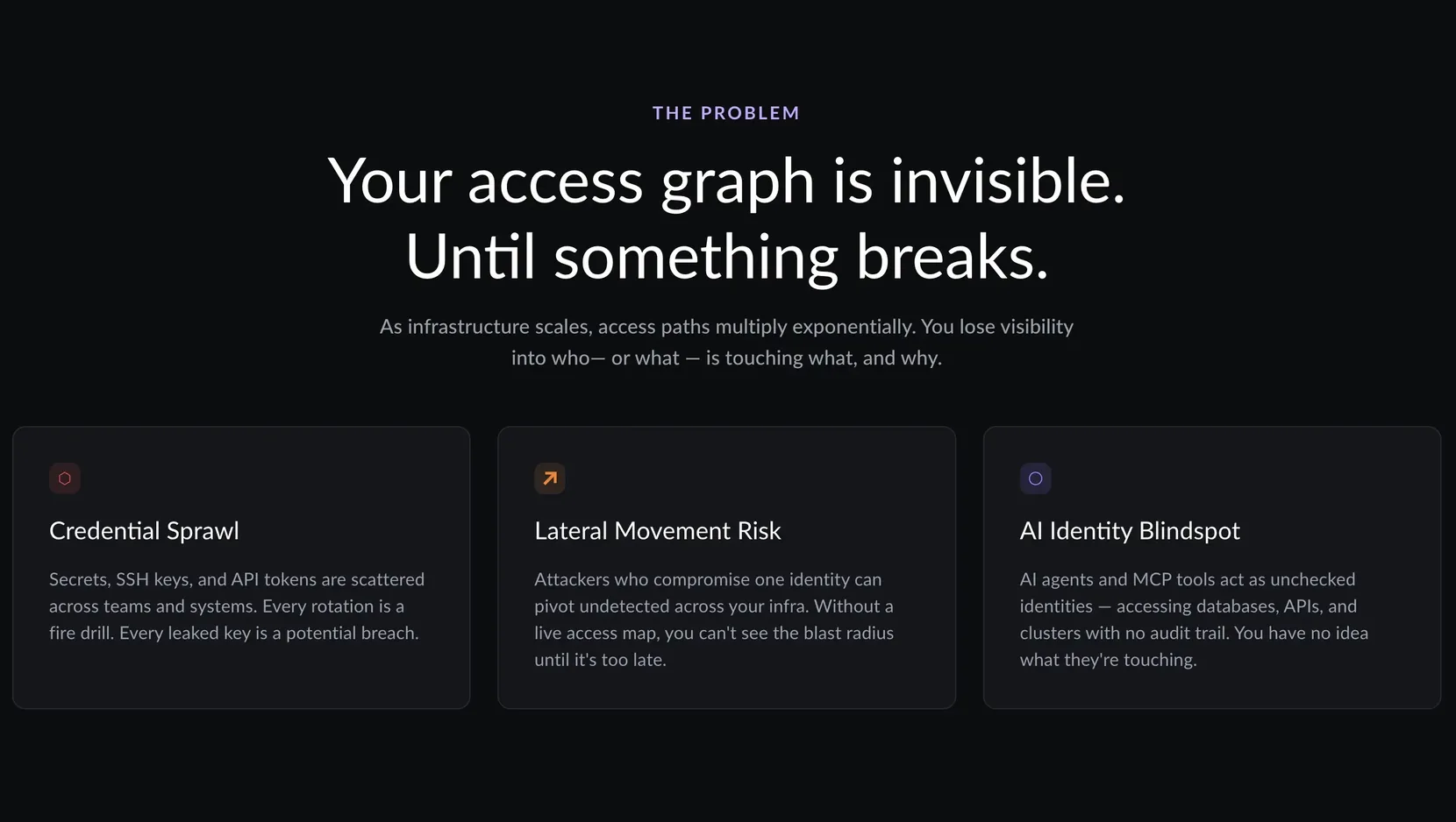
The problem section describes what Atlas solves. It is an eyebrow, a heading, a paragraph, and three cards. This is where I started embedding the card SVGs and standardizing the card layout, type, and spacing so every card grid down the page would match.
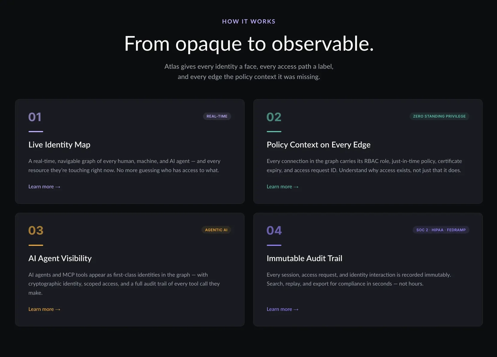
How It Works follows the same pattern with four cards. To pass WCAG AA, I raised the opacity of the numbers and the tokens on the cards, which made their colors more vibrant. The card numbers started as Inter text; I turned them into SVGs, both to cut a font weight and because the cards are not in a strict order, so the numbers are decoration and not content. I also unified the card fonts to Lato to reduce how many font files the page loads.
The interactive product section
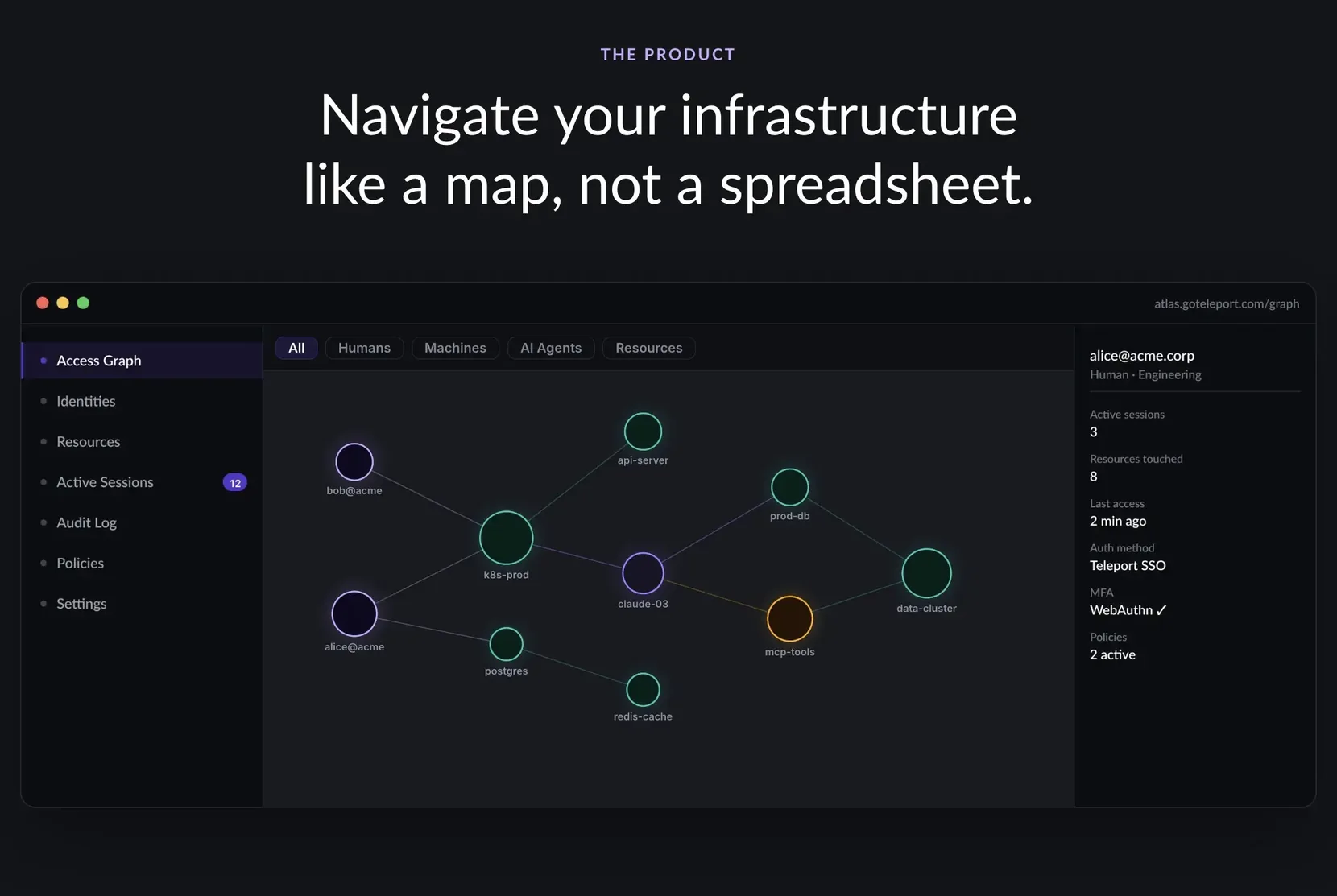
I built the product-section animation with the filtering first, then stripped it down to what the hero section needed. It is an eyebrow and a title with no paragraph, and below that a canvas over a WebP with a row of toggle filters for humans, machines, AI agents, resources, and all of them at once. The canvas draws each type as a labeled dot sized by kind. The tagline reads: “Atlas maps every identity-to-resource access path across your infrastructure in real time, for humans, machines, and AI agents, with policy and audit context on every edge.” The animation respects prefers-reduced-motion. With motion allowed, the graph loads its nodes and then cycles through each filter on its own. I had to turn off the live announcement layer on it, because with a screen reader on and the user scrolled somewhere else on the page, it announced every filter change as it happened. With reduced motion turned on, nothing auto-rotates. The graph loads and the user clicks into each filter themselves.
Testimonials, CTAs, and footer
The testimonial section, What Our Users Say, is an eyebrow, a title, and three cards, each with a quote. The markup is a blockquote inside a figure, which is the semantically correct structure for a quotation. Every card grid on the page, including this one, is a list, so a screen reader tells the user how many cards are in the section before it reads through them.
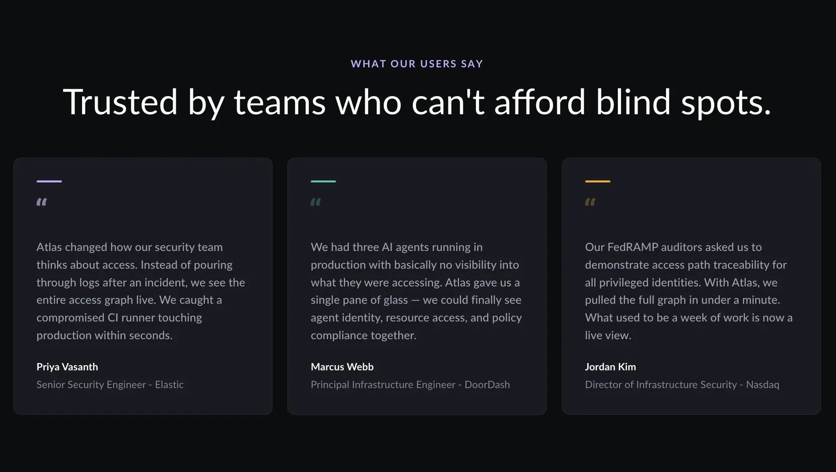
The Get Started section has an eyebrow, a title, a paragraph, and two CTAs, one to request access and one to contact sales. In the Figma file, there is a section for the CTAs, but the CTAs in that section did not match what was actually being used in the primary file section. So I used the hover state from the component section with the CTAs, and then the static state colors from the primary Figma file. Typically, I would want to discuss this with the designer, but in alignment with the challenge, I decided to use my best judgment and then just discuss it during the panel call.
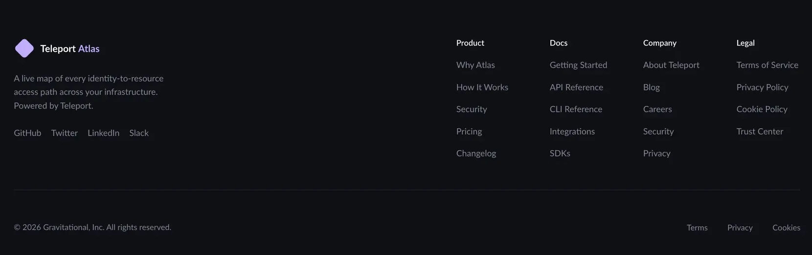
The footer has the logo, a short blurb, and three social links on the left, with four columns of site links on the right. In the Figma those columns were different widths; I standardized them with a CSS grid gap, which makes the footer a little wider but far more consistent. The footer menu was initially built out as a whole set of links within one navigation element. I broke it into separate, labeled columns so a screen reader user hears each column’s heading and item count and can skip the columns they do not want. Below that is a horizontal rule, the copyright, and the legal links.
Cutting the page weight
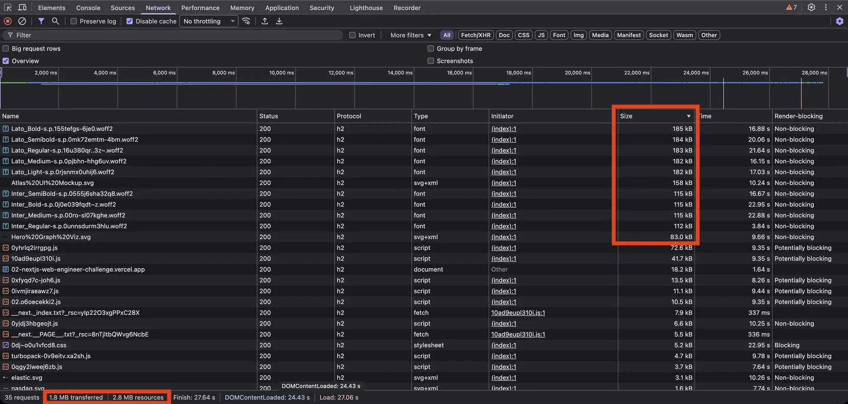
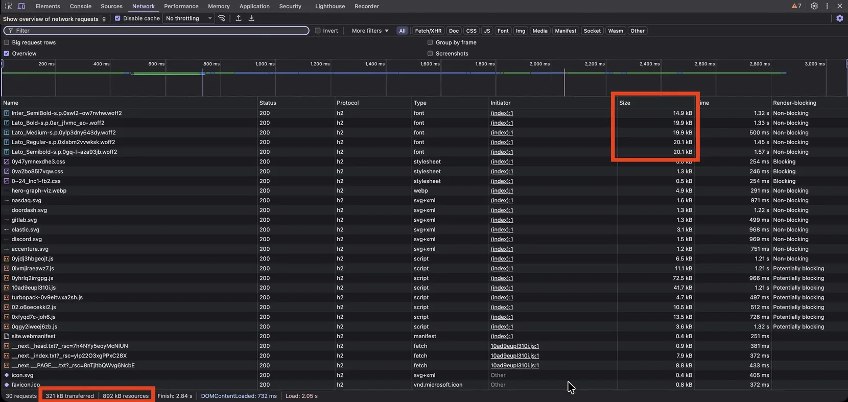
Once the page was built I looked at what it was shipping, and it was close to two and a half megabytes, most of it fonts. I optimized in two passes. First I cut how many fonts the page used. Inter dropped to a single SemiBold weight, used only for the canvas node labels, and everything else became Lato. Then I asked Claude whether there was a better way to shrink the files themselves, and it pointed me at subsetting the fonts with fonttools and brotli, keeping only basic Latin plus the handful of characters a marketing page actually uses, like smart quotes, dashes, and the ellipsis. That cut the font files by roughly 89%. I ran those tools once locally and committed the results, since the fonts were not going to change often on a challenge like this. Between the two passes the page dropped to around 800 kilobytes, and the hero node background brought it back up to about 950. I wrote up the font work in its own article.
The request-access page
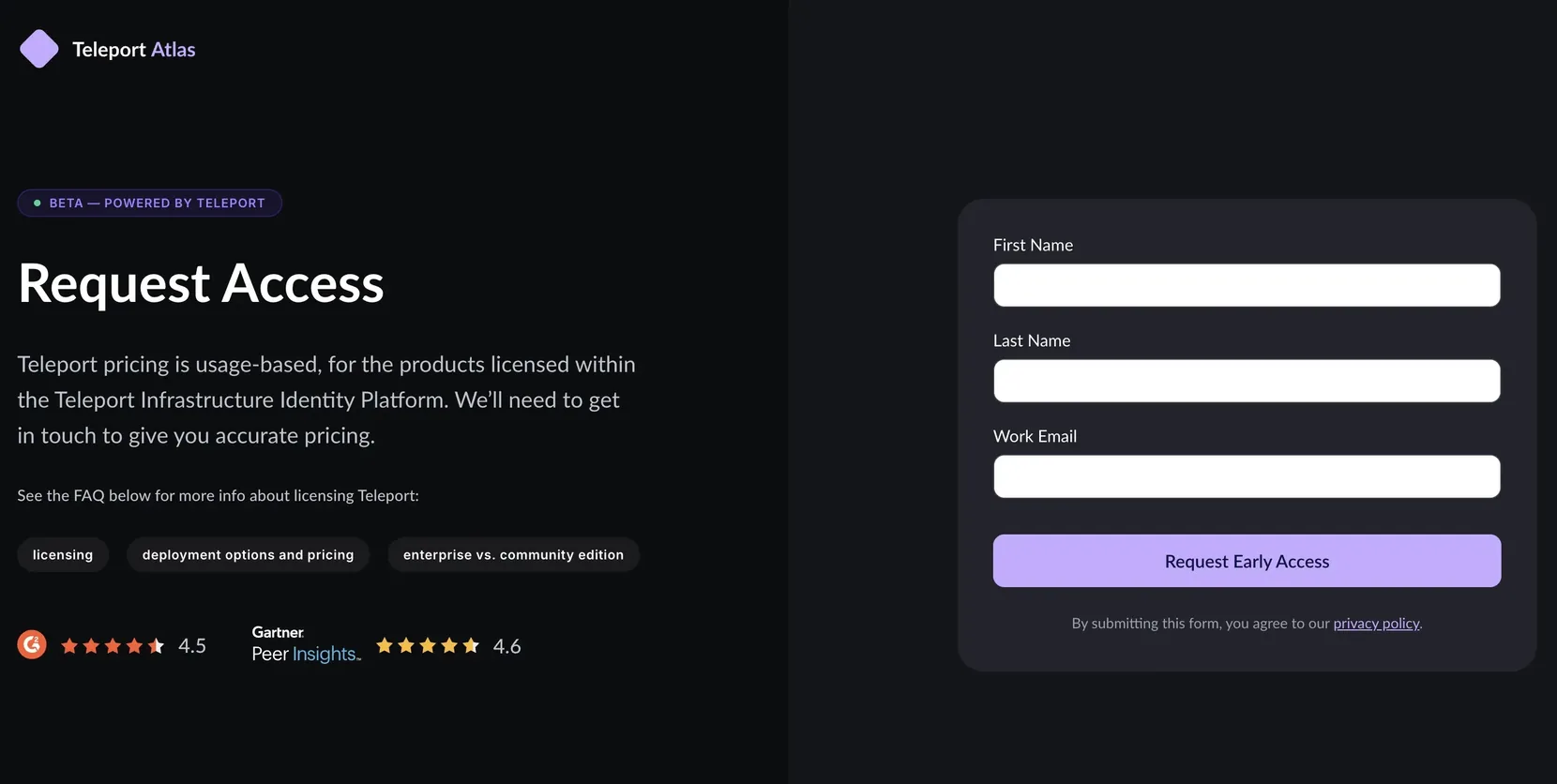
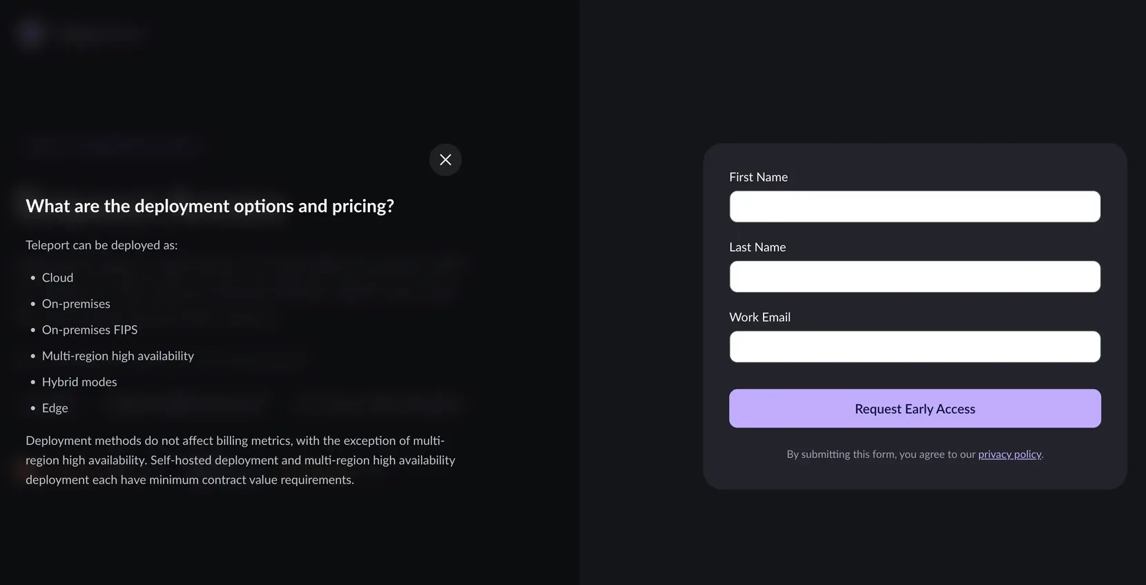
The challenge had an optional second page as a stretch goal, and I built a request-access page as a demo of what Teleport’s real request-access landing could be. Their live version has outbound links, a logo bar that hides and shows and blends white on white against the background, and accordions that move the page as you open them. On my version the only job of the page is to get the user to fill out the form, so I embedded the logo into the content, dropped the top bars, and turned the FAQ topics on the left into modals that only cover the left half of the page. The form on the right stays visible the whole time. The only ways off the page are the logo and the privacy policy. There are G2 and Gartner stars, but they show the rating without linking anywhere. The modal is a full dialog with a focus trap, escape to close, and focus returned where it came from, and the form validates on the client and requires a work email. There is no backend. This page is the one that sits in the chrome-free route group.
Infrastructure and hardening
On the infrastructure side I deployed through the Vercel CLI, since Next.js and Vercel are what Teleport uses internally, and I shipped it as a static export. There is no Node server answering requests, which shrinks the attack surface. The tradeoff is that on-page personalization would need that server back. Because the static export turns off Next’s runtime image optimizer, I pre-optimized the images to WebP with the 1x and 2x variants and committed them.
For the supply chain I used pnpm, configured six ways.
- a seven-day cooldown before a package version is allowed in
- blocking exotic sub-dependencies
- an allowlist, so only two packages are permitted to run install scripts
- exact-version pinning
- a frozen lockfile
- store-integrity verification
The CI pins every GitHub Action to a full commit SHA, so a tag cannot be repointed at different code after I have written the workflow. The JSON-LD is run through a small helper that escapes the characters that could otherwise break out of a script tag.
The panel discussion
An opportunity to dig deeper
The mulberry32 function is a pseudo random number generator with a predictable output. It allows you to have the same generated output with the same input on the server and on the client side so that you don’t have hydration errors. It also allows you to have art direction by having a predictable output that you can drive versus something that’s truly random. One of the panelists picked up on the mulberry32 function used in the hero background graphic, and asked me if I could explain what it does, why it’s there, if it’s important, if it’s needed, that sort of thing. In the moment I couldn’t do that; I kind of froze. What I should have done was simply read the comment above it, which reads “identical output on server and client.” I primarily work in the world of HTML, CSS, JavaScript, PHP; that sort of thing, front-end technologies. I wouldn’t be able to explain the innards of this function, the bit shifting that’s happening and all that. But I should have known the basics of what the function did. And that was kind of a blind spot for me in the discussion.
This is the mulberry32 function from the hero background.
// Seeded PRNG (mulberry32) — identical output on server and client
function mulberry32(seed: number): () => number {
	let s = seed
	return () => {
		s += 0x6d2b79f5
		let t = s
		t = Math.imul(t ^ (t >>> 15), t | 1)
		t ^= t + Math.imul(t ^ (t >>> 7), t | 61)
		return ((t ^ (t >>> 14)) >>> 0) / 0xffffffff
	}
}
The Chrome for Developers team covers controlled randomness in a design context in their HTTP 203 episode Random paint effects.
Generally when I’m reviewing AI code, I’m more concerned about items that have security risks or high-impact implications to the project as a whole. When it comes to items that are more frivolous, such as a purely design-driven item, I’m not likely to look into it as deeply. So for instance, the supply-chain implications of using pnpm over npm and the supply-chain hardening that we did on the project are things I’m diligent on, as opposed to the hero background, which is purely decorative. So long as it didn’t hurt the page performance and did what I wanted, that was my driving goal.
The Teleport Atlas site was a static export, so we didn’t have any chances of the server-side rendering causing hydration issues. So that wasn’t critical, but having the art direction was. The innards of the function aren’t something I typically would concern myself with in this particular instance. Similar to how, if I’m using a library that has a lot of complex functions and I only need a few specific ones, I wouldn’t be diving deep into the library to understand those innards. The part I’m concerned about is whether it’s going to do what I need it to do, and understanding the why and how. In this instance I should have read the comment that was just above the code.
Testing
If you’re building an application that has business logic and it’s going to be long-lived and you need to make sure that it’s doing exactly what it needs to do and nothing more, unit testing is needed there. That’s where you need to do it. On a marketing website, I feel it’s added complexity for something that’s going to be short-lived. Visual regression testing is what I would add to a marketing website. It’s easy to automate and gives you a visual indication when something breaks.
In our discussion, it was brought up that you can just have AI write the testing for you. However, the AI tool might not be testing the right thing, and you still need to understand what’s being tested in the first place. Testing isn’t always about whether it’s doing what I need it to do; it’s about the edge cases, and the AI tool might not pick up on those. The process of adding tests to your marketing website would be adding extra weight on top of it, and it needs to be maintained over time. That, I feel, takes away from what you should be doing, which is making sure that the marketing website is selling the product.
CMS modeling
There was also a question about content modeling. My written answer favored composable, reusable components: a page as an ordered list of section blocks, with one card type carrying a variant field. I had watched a cards component at Seismic grow unmaintainable as more variants were added to one component, so I made the same argument about a CMS, that most of this page does not need a heavy schema.
I later built the content model and reversed the composable-components part of my answer to the panel. See the section below.
Accessibility and results
The titles and eyebrows are handled differently for screen readers. The small eyebrow label is the real heading for each section, and the large display text under it is a paragraph styled to look like a heading. Reading the page by headings with VoiceOver, the short eyebrows on their own did not give enough context, so I appended the rest of the phrase to each eyebrow as visually hidden text and marked the big visual headline aria-hidden. The page still looks like the Figma, and each section has one complete heading for a screen reader to read.
Adding a CMS after the fact
Weeks after the panel, I came back and moved the whole page into Sanity as a headless CMS. The copy had been written directly into the React components, so every text change meant a code change and a deploy.
The first thing that had to change was output: 'export'. Sanity’s Presentation tool needs a running server to serve draft content, and a static export cannot do that. Static export was there to remove the runtime attack surface, and CVE-2025-66478 in the App Router RSC layer had already been patched in the Next version the project was pinned to.
The second was the content-modeling answer I gave the panel. I had argued for composable, reusable components. I built seven typed blocks, and each one matches a section of the Figma file. The requirement for this page was to match that design, and layout controls let an author change the page so it no longer matches. The schema also has no field for heading level, card number, or accent color. All three are worked out from where the section sits on the page, so reordering sections in the CMS cannot break the heading order or the numbering.
Adding a page needs no code. Create the document in the Studio and it serves at its slug without a redeploy. Three pages run on it, and two of them have no Figma design.
I wrote up the content model in From Figma to Sanity. The integration work, including four failures that produced no error message, is in Taking a Next.js App from Static Export to Sanity CMS. The accessibility defects, the security scanning, and the other checks that reported a pass on broken code are in Challenges Building the Teleport Atlas Landing Page.
Wrapping up
I thoroughly enjoyed building this site, even though it started as a coding challenge. It let me flex some muscles I hadn’t used in a while and explore ideas I hadn’t had the chance to try in this new AI-assisted way of working. I took a few lessons from the interview process and came away with a piece I’m proud of and one where I can actually share the source, unlike my other case studies. Although I didn’t make it past the coding challenge part of the interview process, I was grateful that Teleport allowed me to present this coding challenge on my portfolio to showcase what I accomplished.
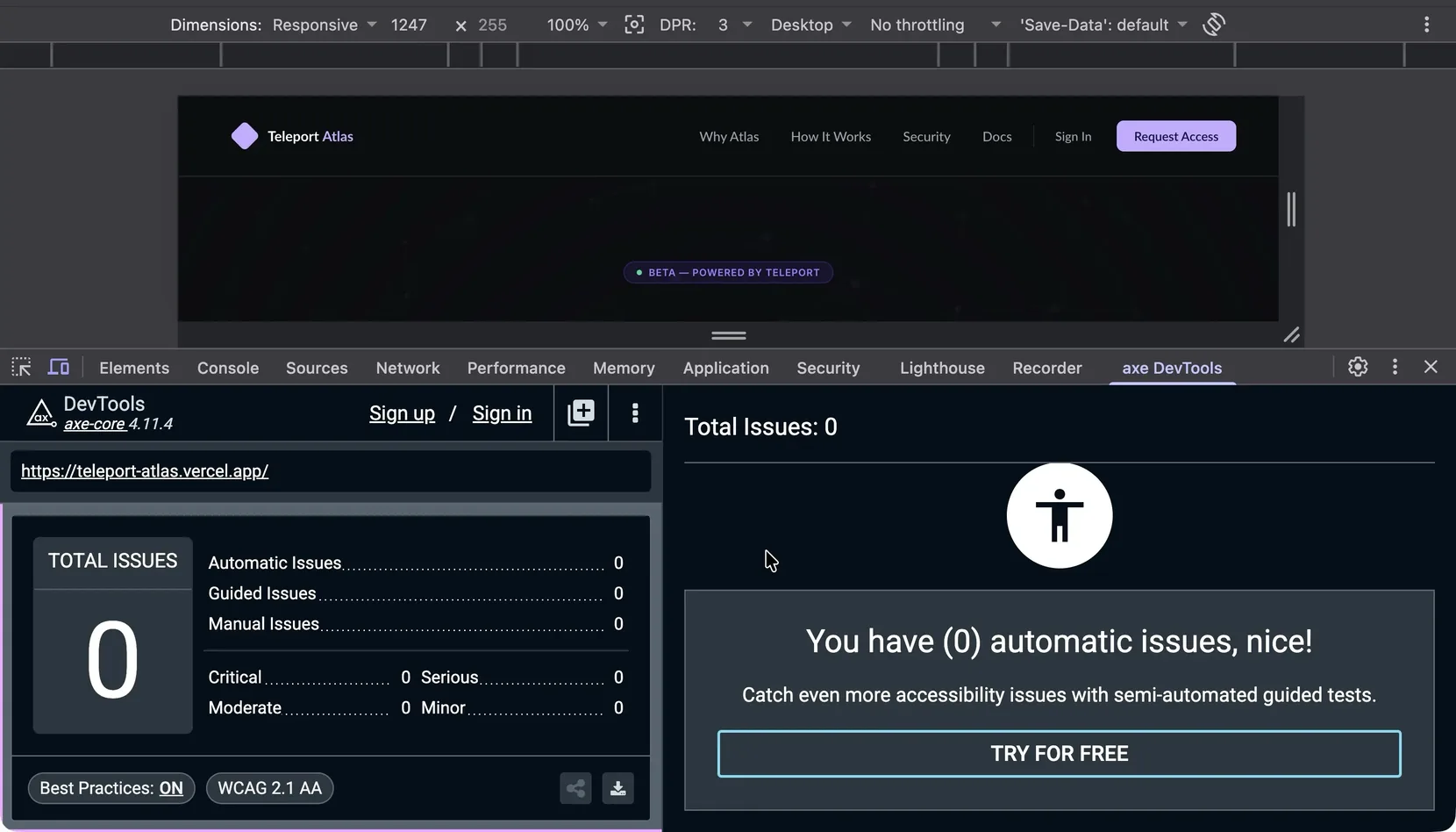
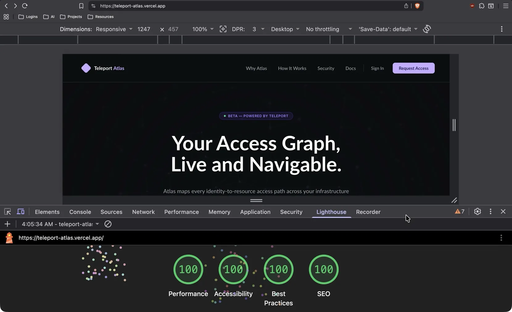
Impact: Built the full Atlas landing page and its interactive product and hero canvases in about twelve hours, from nothing, that first Friday. I spent roughly four hours on Saturday on optimization and another four on Sunday on accessibility testing. On Monday I sent off some questions, they came back with answers, and the next day I built the hero background animation. Most of the work landed in that first handful of days; the rest was adjustments and the request-access page, and the panel discussion itself came about three weeks after I started, once most of the build was done. Page weight came down from about 2.5MB to roughly 950KB and the font payload dropped about 89%. The result is a perfect axe score, zero issues against WCAG 2.1 AA, and a Lighthouse mobile run of 100 across performance, accessibility, best practices, and SEO, both wired into an automated check on every pull request.