The Teleport Atlas landing page was built to a Figma file, section by section, with the copy written into the React components. Moving it into Sanity meant deciding how much of the design an author should be able to change.
The original plan, written before any of it shipped, recommended composable components.
- a heading block
- a paragraph block
- a button block
- a row wrapper to hold them
Those four blocks would have given authors a general-purpose page builder.
I built typed blocks. The requirement for this page was to match the Figma file, and layout controls let an author change the page so it no longer matches. The wiring that connects this model to the frontend is covered in Taking a Next.js App from Static Export to Sanity CMS.
Seven typed blocks that mirror the Figma sections
The model is seven page-builder blocks that mirror the Figma sections, four shared objects (cta, link, logo, sectionHeader), a page document, and a siteSettings singleton.
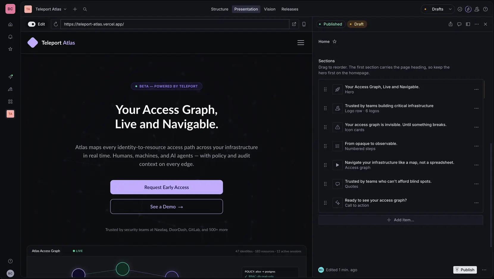
I considered a free-floating heading, paragraph, and button set and decided against it. A free-floating set lets an author:
- stack three
h1elements - drop a paragraph with no heading above it
- put together a section the design never included
Typed blocks with named fields give the same control over the words and the ordering. An author cannot add a heading or change the section’s structure.
There is a tradeoff. A typed block cannot build a layout I did not plan for, so a new layout needs code.
What the schema does not store
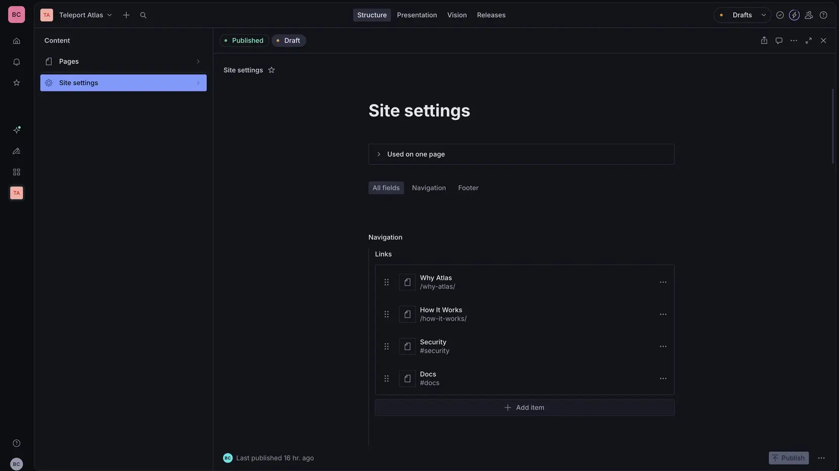
There is no field for heading level, card number, accent color, or subheadline size.
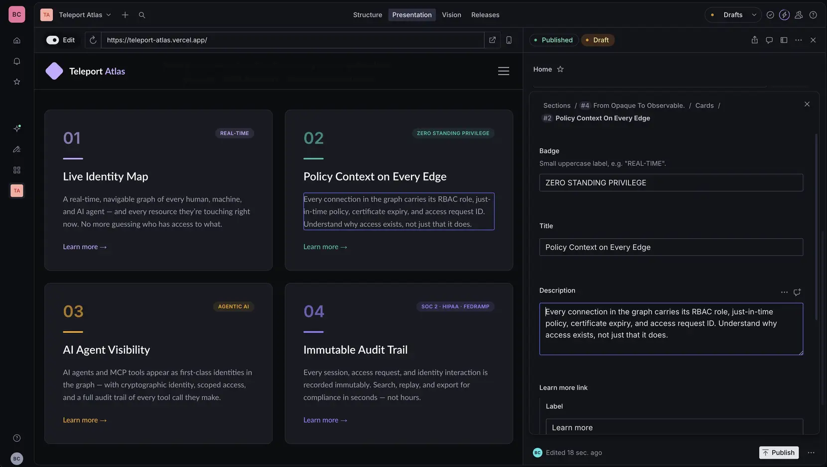
The first three are worked out in the frontend from where the section sits on the page. If they were stored instead, the saved value would be wrong as soon as someone reordered the sections in the Studio, and the CMS would show no error. Reordering the sections renumbers and recolors the cards.
Subheadline size was removed for a different reason. The size depends on which block it is, and an author has no way to answer whether a subheadline should be medium or large.
Deriving heading levels
The same section can open one page and sit in the middle of another. If a block hardcodes <h2> and then becomes the first row on a page, that page has no h1, and every heading under it is at the wrong level.
Every block takes a level prop and resolves its tags through two maps:
/** 1 when the block opens the page, 2 everywhere else. Derived, never authored. */
export type HeadingLevel = 1 | 2

/** The section's own heading. */
export const SECTION_HEADING = { 1: 'h1', 2: 'h2' } as const satisfies Record<HeadingLevel, string>

/**
 * A heading nested inside the section, such as a card title. One level below
 * the section heading, so a card section that opens a page yields h1 > h2
 * rather than skipping to h3.
 */
export const CARD_HEADING = { 1: 'h2', 2: 'h3' } as const satisfies Record<HeadingLevel, string>
CARD_HEADING exists because of a bug found on the second page. Card titles were hardcoded to h3, which is correct under an h2 section header on the homepage. On a page that opens with a card section, that section’s header becomes the h1 and the card titles skip a level.
These are maps instead of functions because the tag gets used as a JSX element type, and the react-hooks/static-components lint rule reads a capitalized variable assigned from a function call as a component defined during render.
The level itself comes from array position, and there is no field an author could set to a wrong value:
export default function SectionRenderer({ block, index }: SectionRendererProps) {
	const level: HeadingLevel = index === 0 ? 1 : 2

	switch (block._type) {
		case 'heroSection':
			return <Hero data={block} level={level} />
		case 'trustedBySection':
			return <TrustedBy data={block} level={level} />
		// every case passes level
	}
}
Removing the card count caps
Three card sections originally had maximum counts of three, four, and three. Those numbers came from the homepage design.
The caps made the blocks unusable on any page that needed a different number. If I wanted six testimonials on another page, I could not do it.
The caps are gone, and anything based on position now repeats. Colors use index % ACCENTS.length, and the icons reuse whichever ones the author picked. The array can be any length and nothing breaks.
One section needed a code change first. The how-it-works numbers, 01 through 04, were four hand-drawn glyphs committed as SVG path data. The SVG path data is what capped the section at four, because the digits 5 through 9 were not in the repo, and drawing them would have meant adding back an Inter Bold font file that an earlier font-subsetting pass removed. The numbers are now plain text in the Inter font the page already loads. There is no upper limit, and removing the path data saved about 4KB.
I considered a color picker for the accents and decided against it. Giving the author a color picker makes them responsible for contrast, and the four colors already in rotation were checked against the row backgrounds they appear on.
The hero still has Rule.max(2) on its buttons, because the hero lays them out in a single row and there is no wrapping behavior designed for a third. The card caps came off because a card grid already wraps and a carousel already scrolls, so a longer array still renders.
Five presentation fields
The schema stores no presentation values, with five exceptions:
| Field | Values | Where |
|---|---|---|
background |
closed set of row treatments | every block |
display |
grid or carousel, plus an autoRotate toggle |
card sections |
display |
static or marquee |
logo row |
visual |
accessGraph or none |
hero |
mediaPosition |
left or right |
image-and-text block |
The two display fields share a name and are separate definitions. The card version offers a grid or a carousel and an auto-rotate toggle. The logo version offers a static row or a marquee, with no toggle, because picking the marquee is what turns the motion on.
Each one is a fixed list of options the frontend already implements, so an author can only pick a layout that has been designed.
Carousel rotation speed stayed a constant in the component and never became a field. If an author could set it, they could set it fast enough that nobody can read the cards.
One more field is stored on every block and is not in this table. anchorId makes a section linkable as #your-anchor from the nav or a button. It names a section and does not change how the section looks.
Any other value that would only pick a CSS class name has no field. The frontend picks the class name.
Naming blocks by what they contain instead of by homepage row
The blocks were originally titled after the homepage row each was drawn for. “Problem”, “How It Works”, “Testimonials”.
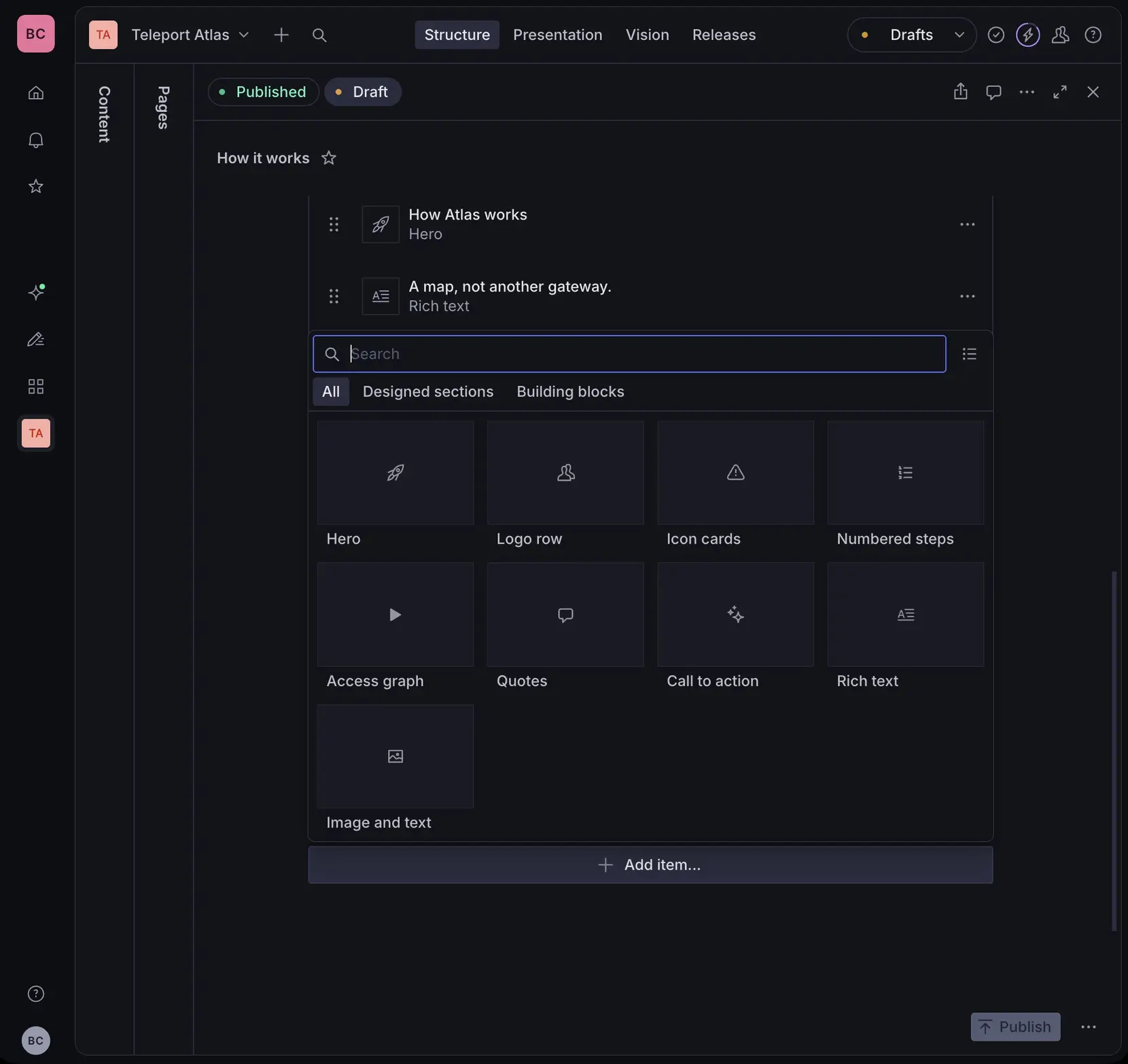
Those names are wrong as soon as a block is reused on a page about something else. A marketing page listing six product capabilities uses the icon-card block, and the insert menu still calls it “Problem”.
Titles now describe what the block contains. “Icon cards”, “Numbered steps”, “Quote cards”. The homepage role moved into each block’s description.
Schema name values were left untouched. Renaming a schema name means every document already using that block no longer matches a type in the schema, so only the title changed and no migration was needed.
The insert menu groups the blocks into two tiers through options.insertMenu.
- the sections drawn from the Figma
- the generic building blocks added later for pages that have no design
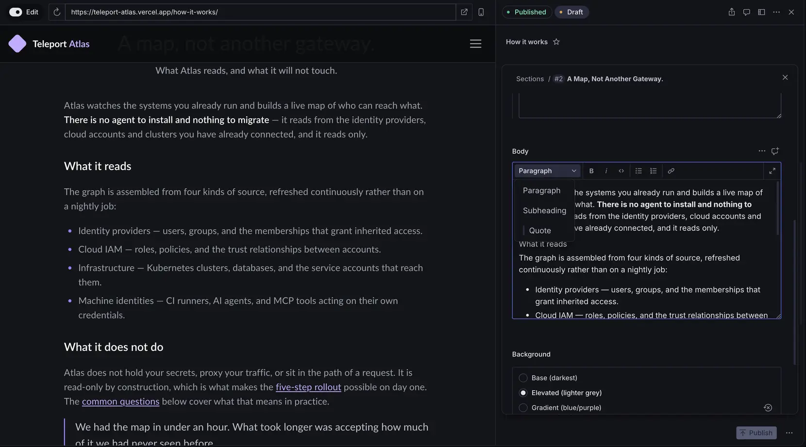
Rich text with no heading styles
Sanity’s default block type offers H1 through H6. This model does not expose any of them.
of: [
	defineArrayMember({
		type: 'block',
		styles: [
			{ title: 'Paragraph', value: 'normal' },
			{ title: 'Subheading', value: 'subheading' },
			{ title: 'Quote', value: 'blockquote' },
		],
		lists: [
			{ title: 'Bulleted', value: 'bullet' },
			{ title: 'Numbered', value: 'number' },
		],
“Subheading” resolves through CARD_HEADING[level] in the frontend, one level below whatever heading its section carries, so it cannot skip a level from any position. Adding h2 back to that style list would let an author skip a level again.
Decorators and annotations are a fixed list for the same reason. There is no inline color, font size, or alignment. Those are all just CSS class names.
What the author actually sees
Every block and every card defines a preview with a prepare(), so a row in the page builder shows its own headline and what kind of block it is.
preview: {
	select: { name: 'name', org: 'org', quote: 'quote' },
	prepare({ name, org, quote }) {
		return { title: name || 'Unattributed', subtitle: org || quote }
	},
},
A quote card with no name reads “Unattributed”. Without the prepare() it would read “Object”. If the company is empty it falls back to the quote itself, so the row shows the quote text.
Rule.required() is set on every field a block cannot render without, and the card arrays use Rule.min(1), so a section cannot be published empty. The anchor field validates against a pattern with a named rule, lowercase words joined by hyphens, so the error message uses that wording and never shows the regular expression.
Field descriptions state what the schema cannot show. The auto-rotate toggle says “Advances every 6 seconds. Pauses on hover, on keyboard focus, and when a visitor presses pause. Ignored for visitors who prefer reduced motion.” The quotes array says “Drag to reorder. Accent colors follow this order automatically. Past three, switch Card display to carousel.” The quotes description tells the author that reordering renumbers and recolors the cards.
Auto-rotate is also hidden until it applies:
hidden: ({ parent }) => parent?.layout !== 'carousel',
An author who picks a grid never sees the rotation toggle.
Where Studio validation stops
Link fields validate against a pattern that accepts a site-relative path, an in-page anchor, or an https:// URL. That check runs in the Studio form and nowhere else.
Anything written by the import CLI, a migration script, or a direct API call never passes through it. The seed scripts on this project write NDJSON straight to the dataset, which is how a set of bare # placeholder links got in.
So the same pattern exists a second time in the frontend, and every CMS link renders through a component that checks it. A link that fails renders as a span, so the words stay on the page but there is nothing to click, and the styling is dropped so it does not look clickable.
;/^(\/(?!\/)[^\s]*|#[^\s]*|https:\/\/[^\s]+)$/
The (?!\/) after the first slash stops //evil.com from reading as a site-relative path. A browser resolves that form as a protocol-relative URL to another origin, and in the Studio it looks like an internal link. The pattern accepts only a path, an anchor, or https, so a javascript: URL in a CMS field is rejected.
TypeGen
The result types come from Sanity TypeGen, which generates them from the actual queries and the actual schema. I did not hand-write them, because hand-written types go out of date the first time someone changes a query and forgets to update them.
The GROQ projections in this project repeat a lot. Pulling the shared parts out into constants and interpolating them back in does not work.
// This does not work.
const cardFields = `_key, icon, title, body`
export const PAGE_QUERY = defineQuery(`*[_type == "page"]{ cards[]{${cardFields}} }`)
Interpolating a fragment collapses the template literal to the type string. TypeGen keys its query-to-type map on the literal, so with a fragment in the middle every result came back as {}. The projections are written out in full instead:
export const PAGE_QUERY = defineQuery(`*[_type == "page" && slug.current == $slug][0]{
	_id,
	title,
	"slug": slug.current,
	pageBuilder[]{
		_key,
		_type,
		background,
		anchorId,

		_type == "heroSection" => {
			badgeText,
			headline,
			description,
			socialProof,
			visual,
			ctas[]{_key, label, href, variant, showArrow}
		},
		// one projection per block type
	}
}`)
The generated types match the queries.
Two other things about TypeGen cost me time.
- It reads the app’s queries through a relative path set in the Studio’s
sanity.cli.ts, so renaming either directory makes it print “no queries found” and never report an error. - React keys have to be
_keyand never the array index. An index key breaks the visual editing overlays and causes hydration mismatches when cards get reordered. Using the index to work out the number shown on the card is still fine.
Adding a page
Adding a page needs no code. Create the document in the Studio, and the [slug] route serves it at /<slug>/.
generateStaticParams pre-renders the pages that exist at build time, and dynamicParams stays at its default of true, which means a page created after the last deploy still works. It renders on the first request to it, and no redeploy is needed.
Two slugs are reserved and return a 404 from the catch-all:
export const RESERVED_SLUGS = new Set(['home', 'request-access'])
home renders at /, so serving it at /home/ as well would be duplicate content. request-access is a hand-built file route, which Next resolves ahead of a dynamic segment, so a Sanity document using that slug would never be served and nothing would report an error. The schema rejects both at authoring time.
Three pages run on this model now, and two of them have no Figma design.