Touch Point Media is a healthcare podcast network that started as an internal project at Gray Digital Group, where I was the developer on the build. The designer was Josephine Medel, and I think she did a terrific job on the layout. The base framework was Foundation for Sites paired with my WP Foundation 6 starter, which meant any other developer who came onto the project got the same development environment I had without any setup friction.
We used the Seriously Simple Podcasting plugin for episode display and management. Looking back, I think we could have gotten the same result with custom post types and avoided the plugin dependency entirely, but SSP worked and the project shipped cleanly. Shows, episodes, hosts, guests, advertising slots, and social accounts were all structured as related content in the back end, configurable per show with no code changes required for each new addition.
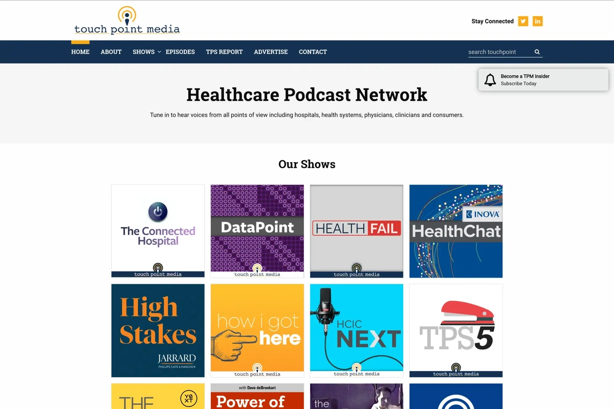
The homepage opens with a CSS animation: the phrase “a healthcare podcast network” slides down into position. Below that, you get the full list of shows on the network, followed by the latest episodes from all shows combined. At the bottom of the page, a call-to-action box encourages advertisers to come and place their ads on TPM shows. The footer includes a Gravity Forms subscription form so visitors can sign up for network updates.
The main navigation has a Podcasts dropdown that lists every show on the network. We used the Superfish plugin on that dropdown, which adds a short delay when your mouse leaves the menu before it closes. It seems like a small thing, but if you’ve ever accidentally moved your cursor slightly off a dropdown and had the whole thing disappear, you know how frustrating that is. Superfish gives you a moment to come back before it goes away, and I thought it was a nice accessibility touch.
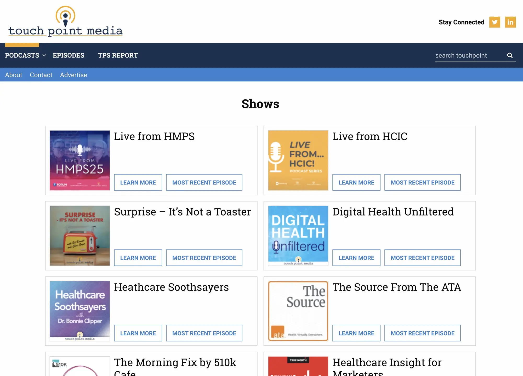
The shows listing page gives each podcast its own card: a square show icon, the title, a Learn More button, and a Most Recent Episode button. Clean and functional.
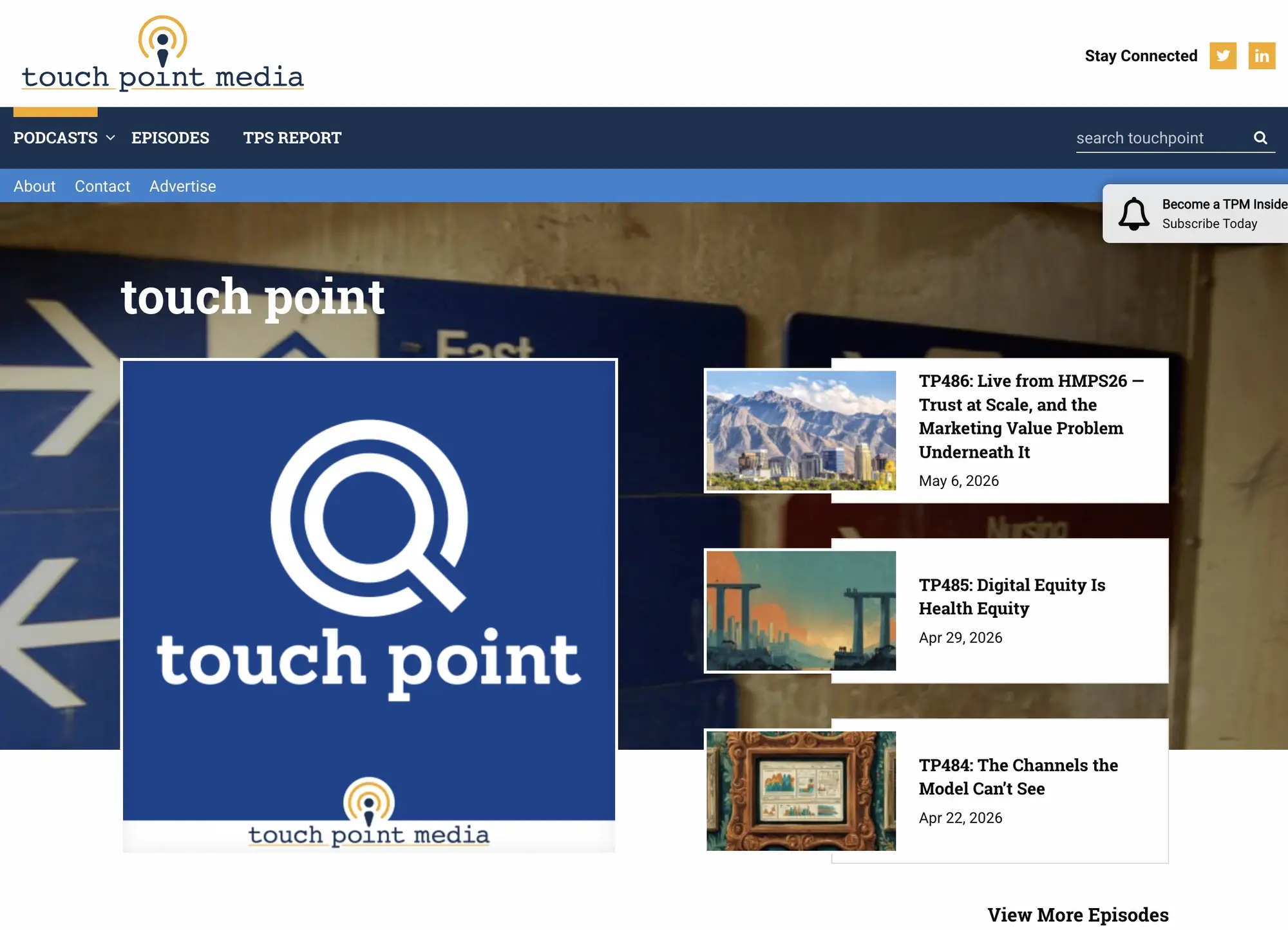
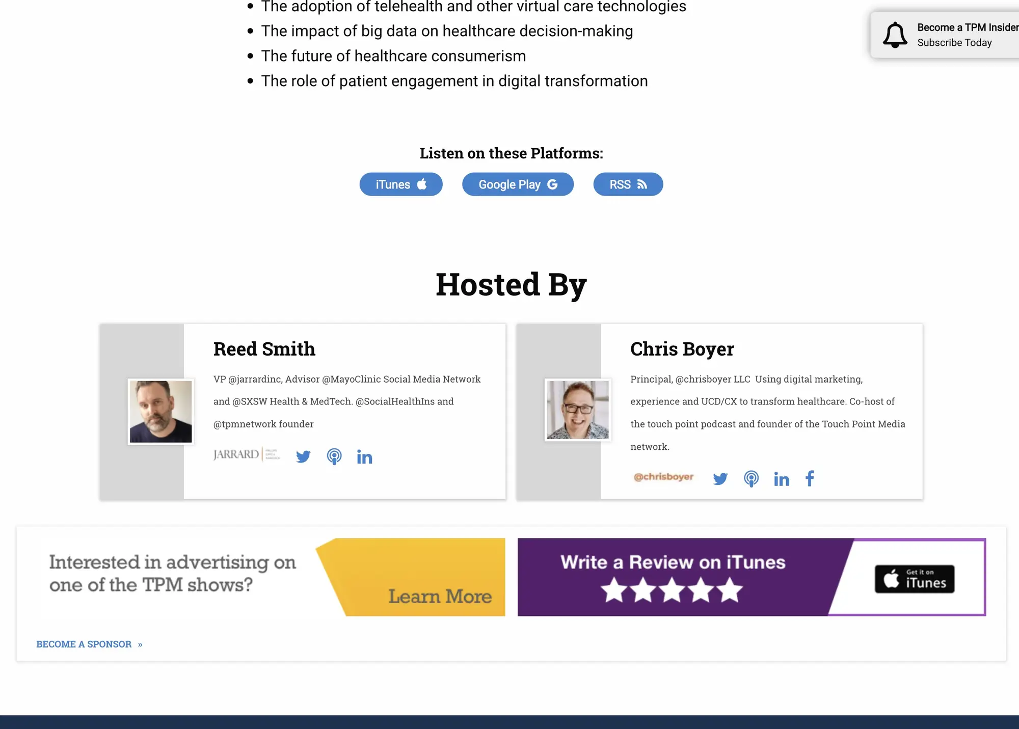
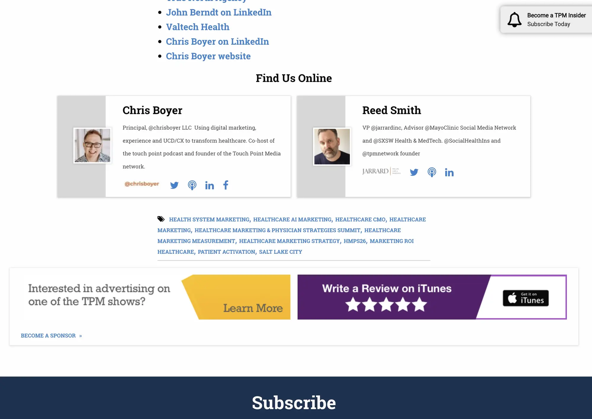
The show detail page is my favorite design on the site. At the top, there’s a large banner background image with the show’s square icon on the left and a stack of three most-recent episodes on the right, each with a link to the episode and a View More Episodes button below. It’s a dynamic, visually engaging layout that puts both the show’s identity and its latest content front and center without either competing for attention. Below the banner is an about section for the show, listen-on-platform buttons for iTunes, Google Play, and RSS, and a Hosted By card. That card has a distinctive layout: the left column is gray with the host’s photo sitting inside it, and the right side carries the host’s title, a bio excerpt, and three social links. Everything on that card is configurable in the WordPress admin per show, and you can assign different hosts and guests per episode.
The show page footer carries the platform links and an advertising slot for potential sponsors.
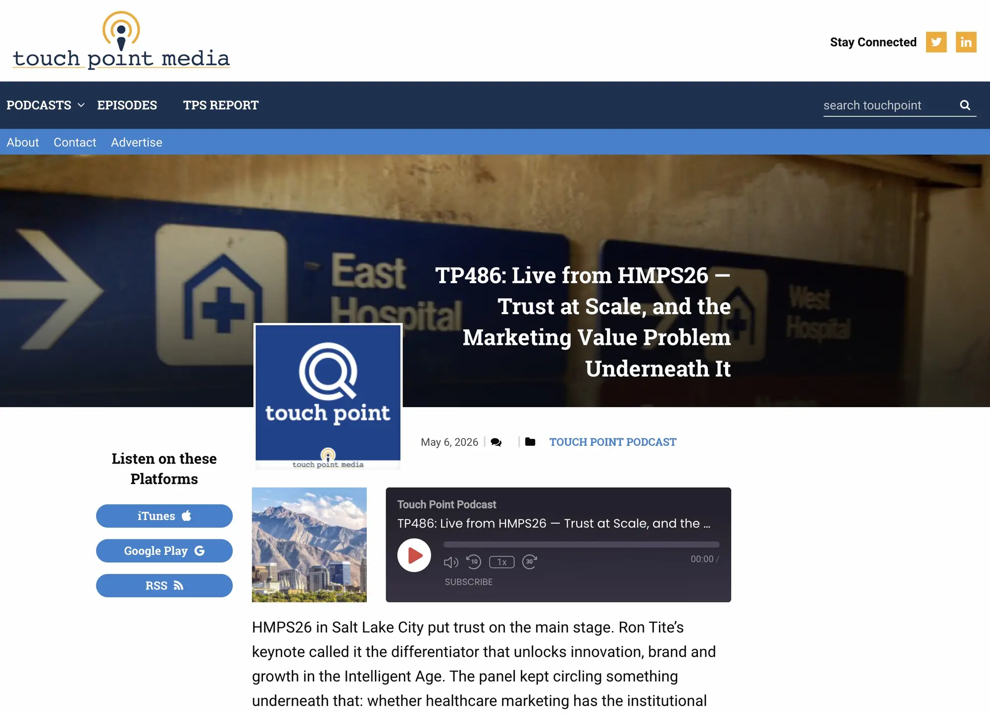
The episode page opens with a banner that puts the show’s icon on the left and the episode title on the right, with the air date, a scroll-to-comments button, and the show name below. On the left side of the page, a persistent sidebar links out to iTunes, Google Play, and RSS, plus any additional platforms the show exists on, which are configurable in the back end. The podcast player sits at the very top of the main content area. Originally this was hosted through Podbean, though the hosting provider has changed on more recent versions of the site. Below the player is the episode description, which can also serve as a full transcript when one is available. The “Find Us Online” section reuses the same host-and-guest card layout from the show page, so guests who appear on an episode get the same presentation as the show’s regular hosts.
The episode footer closes out with tags, related episode postcards, and another advertising slot with a link to the full sponsors page.
The main Episodes page lists every episode across all shows in a grid, with a toggle to switch to list view. The pagination design is well executed: forward and back arrows, clean spacing, and enough visual weight to be easy to use without being oversized. The About page lists all the hosts on the network with a general about statement at the top. There’s also a Contact page for general inquiries, an Advertise page where prospective sponsors can submit a placement request, and a TPS Reports page dedicated to newsletter signups.
A toast notification appears in the top-right corner of the screen inviting visitors to become a TPM Insider and subscribe. When you’re at the top of the page, it sits below the navigation so it doesn’t overlap the menu. As you scroll, it animates up into the corner. If you dismiss it, it stays gone. I liked how that notification moved, and the placement logic felt thoughtful rather than intrusive.
WP Rocket handles static page caching and Cloudflare provides the firewall, CDN, and additional caching layer on top. The site loads fast.
Impact: Launched with four shows. Now more than fifteen on the same architecture, with no engineering work required per new show. WP Rocket and Cloudflare keep load times under one second.