Live Healthy Austin was a healthcare blog built for St. David’s HealthCare at Gray Digital Group in 2015. The site gave the health system a dedicated space to publish wellness content, authored by a rotating set of contributors, separate from the main stdavids.com property. Tim Smith designed the site with a mobile-first approach, and the finished product was responsive across desktop, tablet, and mobile.
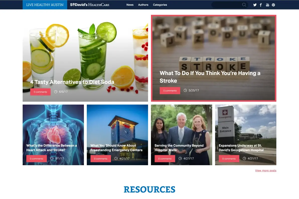
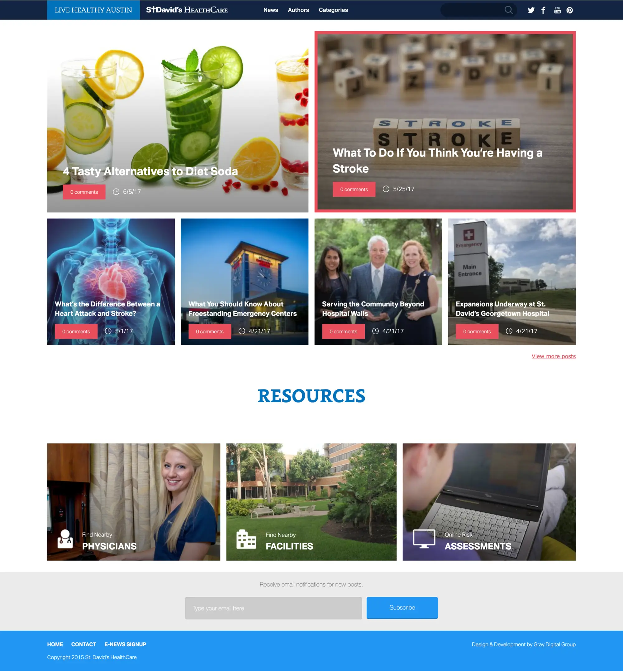
The home page opens with two large featured article cards stacked side by side at the top of the layout, followed by a row of four smaller square cards below. That six-card arrangement gave editors control over which content got the most visual weight at any given time. Below the cards, a resources section linked out to three key tools on the St. David’s HealthCare website: a physician finder, a facilities directory, and a health assessments tool. An email sign-up block for new post notifications sat below the resources section, with the site footer underneath.
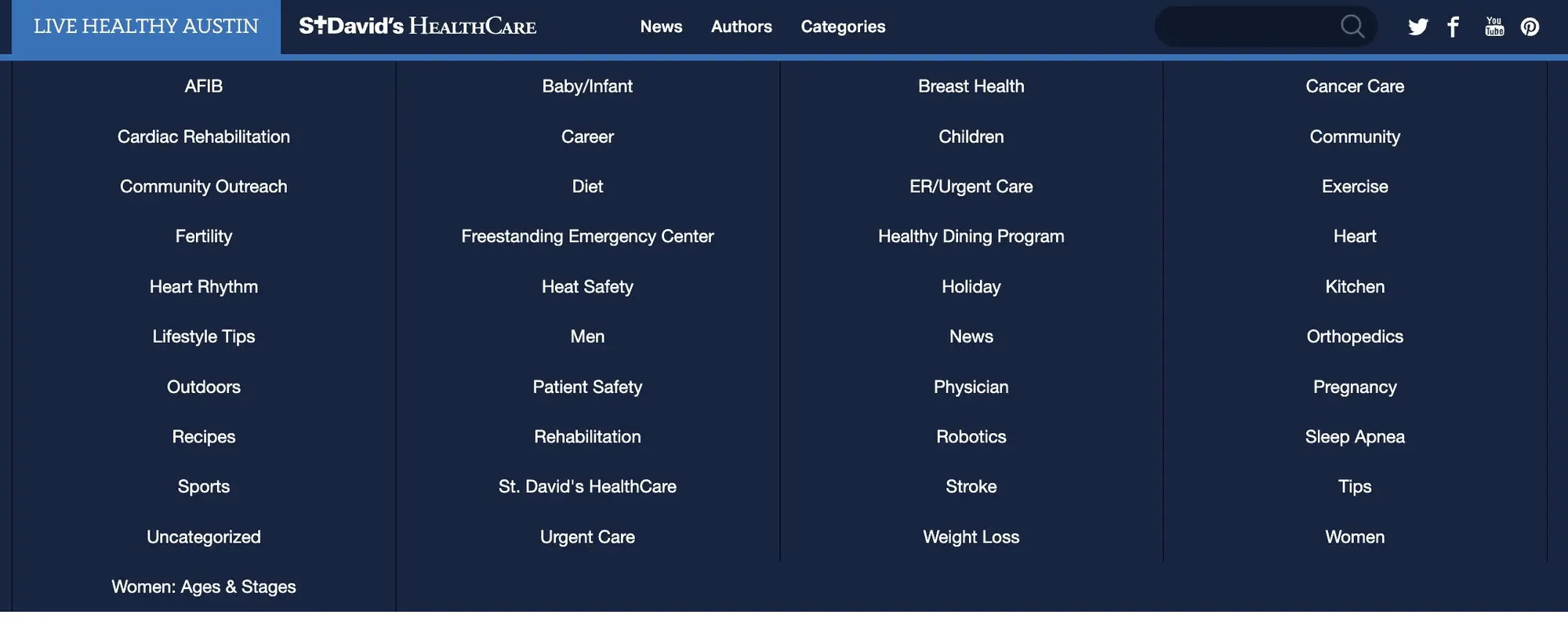
The category navigation triggered a full-width drop-down panel from the main menu. Each category was presented as a card inside the panel, and hovering over any card animated a background color that radiated outward from the center of the card to fill it completely before you finished moving your cursor across. It was a small detail, but one that gave the navigation real personality and made browsing by topic feel deliberate rather than mechanical.
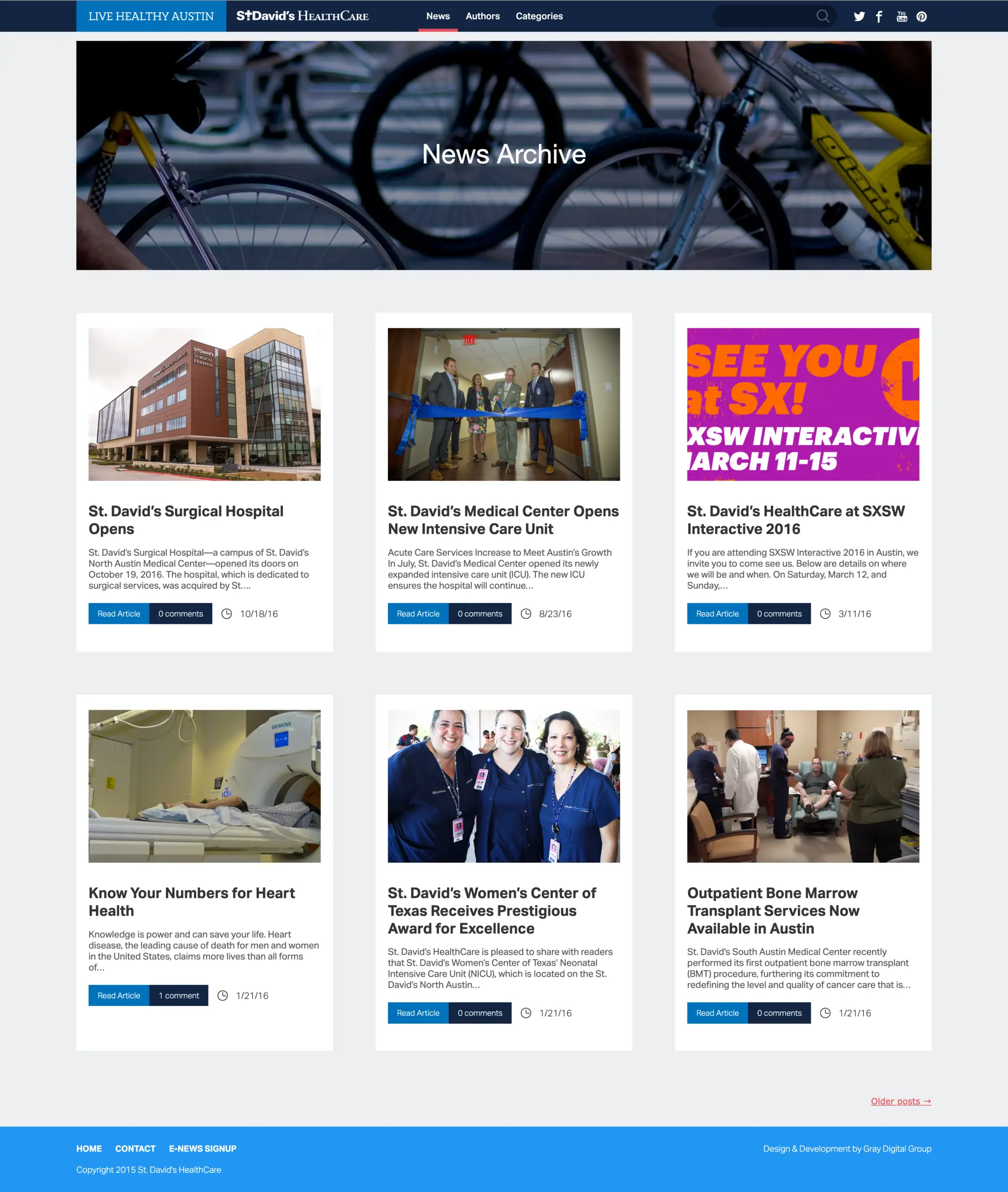
The news archive was the standard post listing view: a grid of article cards, each showing a thumbnail, title, excerpt, a “Read Article” button, a comments count, and a publication date. A load-more control let readers step further back through the archive without leaving the page.
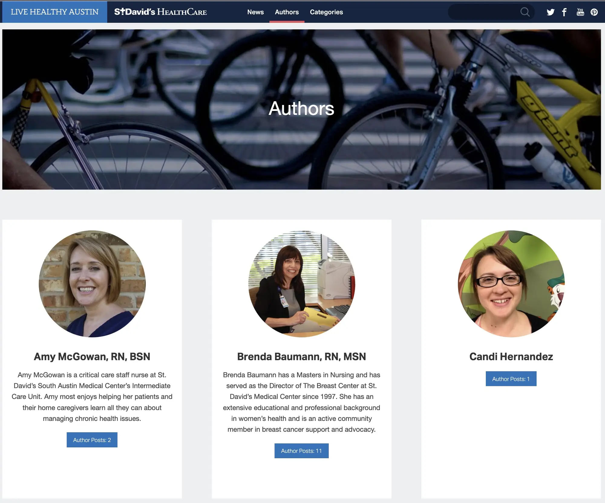
The authors page presented each contributor with a photo, a short bio excerpt, and a button that linked through to that author’s full post listing. The design kept the page scannable while giving readers enough context to seek out writers whose perspective they wanted to follow.
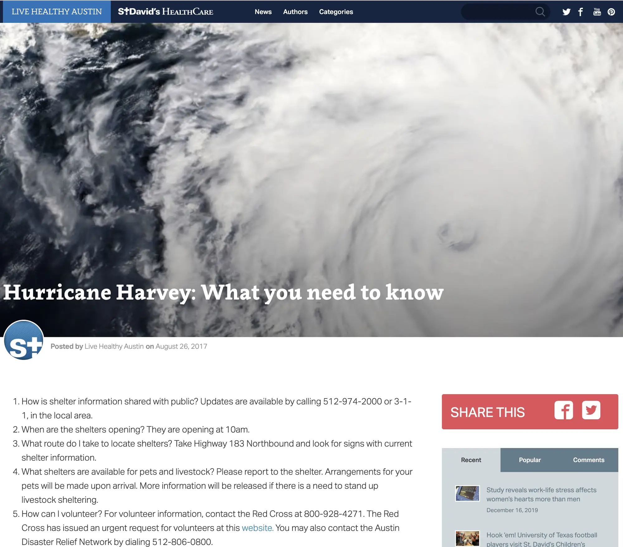
Individual article pages opened with an edge-to-edge banner photo spanning the full browser width, with the article title overlaid directly on the image. Below the banner, a small author thumbnail appeared alongside a “Posted by” credit and the publication date. The article body was authored in the WordPress editor. DISQUS handled commenting at the bottom of each post. On the right sidebar, a Facebook and Twitter share block sat above a tabbed interface that toggled between Recent Posts, Popular Posts, and Recent Comments, giving readers a clear path to more content without scrolling back to the top.
Performance was a priority from the start. WP Rocket handled page caching and asset optimization, and Cloudflare sat in front of the site for CDN delivery and additional caching. The combination brought load times below one second on a straightforward shared hosting setup, which was strong performance for a WordPress site in 2015.
On mobile, the layout stacked cleanly from desktop through tablet down to phone. The navigation collapsed into a slide-out panel that appeared from the side when the menu icon was tapped. The panel contained three links, and tapping anywhere in the negative space outside the panel closed it without needing a dedicated close button. That interaction pattern was common in native apps at the time but less common on the mobile web, and it made the site feel polished at small screen sizes.
Impact: Published content platform for St. David’s HealthCare with multi-author support, email subscriber notifications, and social sharing integrated. Sub-one-second load times on WordPress via WP Rocket and Cloudflare. Fully responsive across desktop, tablet, and mobile with a slide-out navigation panel optimized for touch.