OK Tours is a regional bus tour operator running trips across the US, from day casino runs to multi-night destination packages. The site was built at Gray Digital Group with a mobile-first brief, using Sitefinity as the CMS. Sitefinity’s content model was a good fit for the client’s operation: tours were structured as reusable templates with configurable days, nights, and dates, so adding a new departure for an existing destination meant filling out a form rather than rebuilding a page. The site had built-in Sitefinity caching from the start.
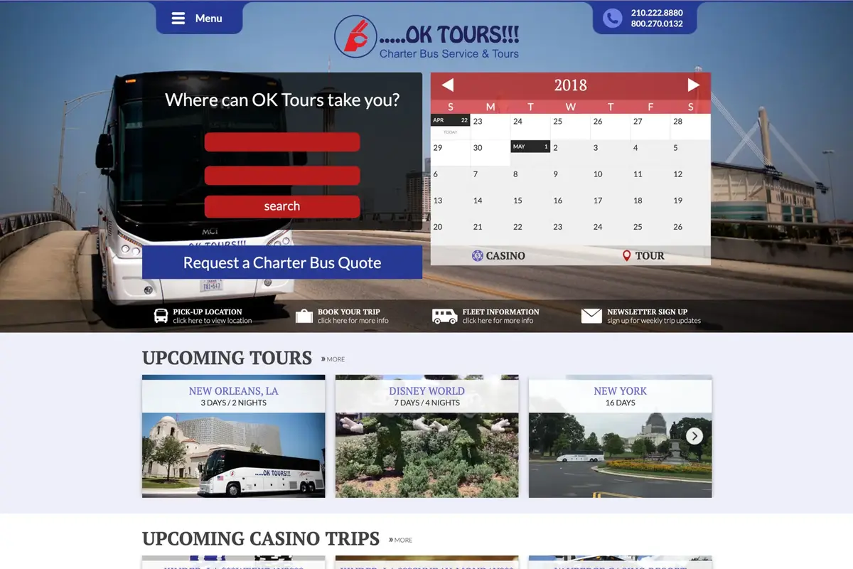
The header is where the most design thought went. Josephine Medel gave it two tabs at the top of the page, one for navigation and one for contact numbers, which together made the entire header read visually like the front grille of a bus. That callback to the fleet was intentional, and it lands clearly when you know to look for it. On the left side of the header, a questionnaire used select lists to walk users through what kind of trip they were looking for and surface matching tours. A prominent charter bus quote button sat below that form. On the right side of the header was the custom calendar.
The calendar was the most technically involved piece of the build and the one I was most satisfied with. I wrote it from scratch in jQuery. Past dates were greyed out; dates from today forward were rendered in color. Any date with a scheduled tour got an icon: one for casino bus trips, one for standard tours. Both icons were SVG to stay sharp at any size. Clicking an icon linked directly to the tour detail page for that date. The calendar supported month-by-month and year-by-year navigation, handled the first and last days of a month correctly within the grid, and the tour icon data was pulled from Sitefinity’s content layer. We never reused the calendar component on another project, but it was a satisfying thing to get right.
Below the header, the homepage had a row of quick links: pickup locations, book your tour, fleet information, and newsletter signup. Below that were sections for upcoming standard tours and upcoming casino tours, each linking out to their destination pages. The lower section of the page had three columns: a testimonial pull, a fleet information block, and a stay-connected panel. The stay-connected panel used a jQuery social stream plugin to pull posts from the client’s Facebook and Twitter accounts and scroll through them automatically. This was 2015, before those platforms required substantial authentication overhead to access feed data, and the live social content worked well as a lightweight engagement layer. Below that was the footer with site links, the company address, and logos.
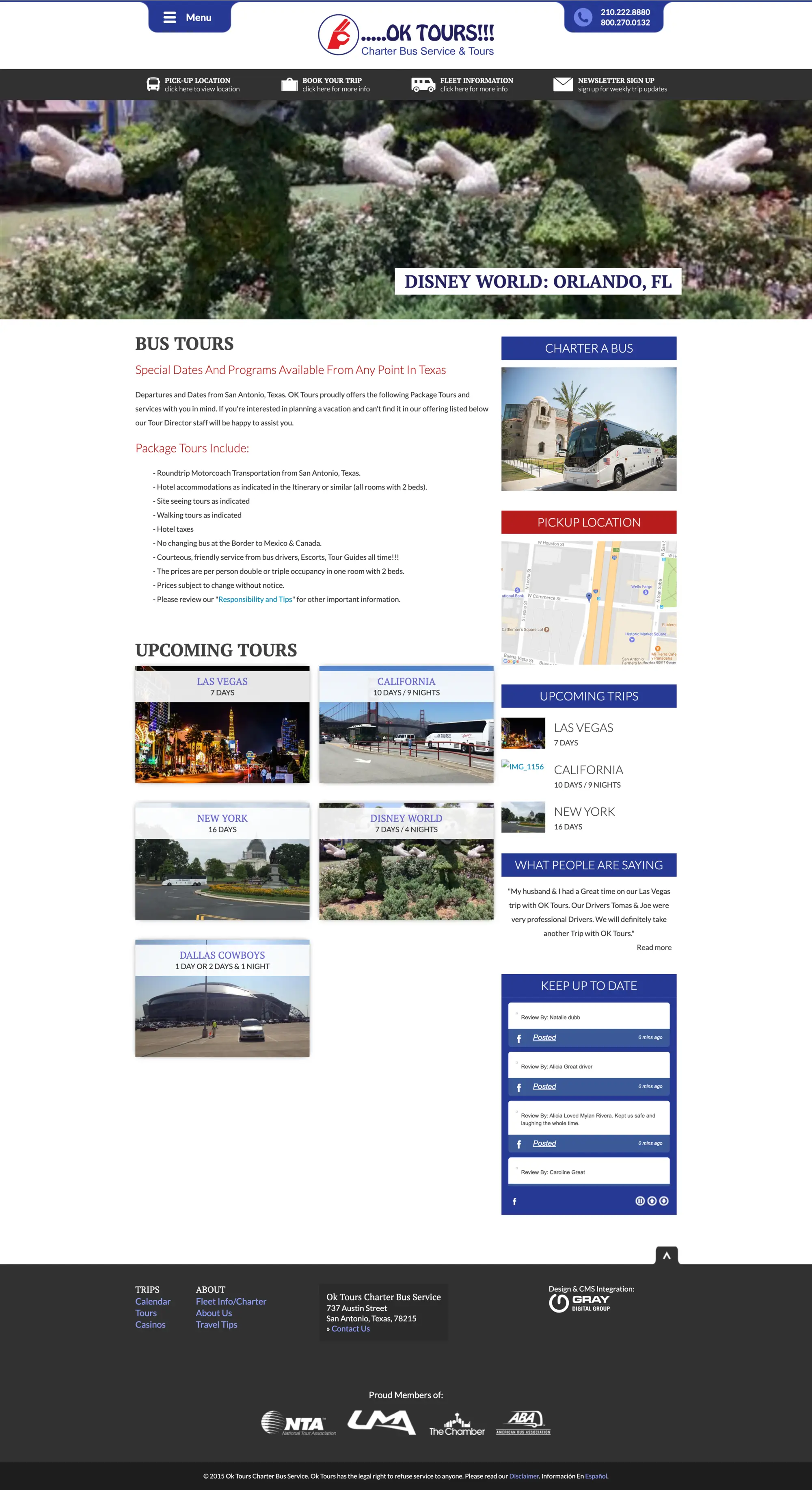
The bus tours section opened with a scrolling carousel of featured destinations: Vegas, California, Disney World, and others. Each destination had its own location page. Those pages used a split-header layout: the left panel held a photo gallery that could be expanded to fill the full width of the page and collapsed back into its half of the header. The right panel showed the location name, trip details, and a book-your-tour link. Below the split header, the left column held pricing, a full itinerary, and detailed descriptions of each itinerary item, with another book CTA at the bottom. The right sidebar held quick links for chartering a bus and finding a nearby pickup location, a list of upcoming trips for that destination, a testimonial, and the social stream again so users could stay current without navigating away.
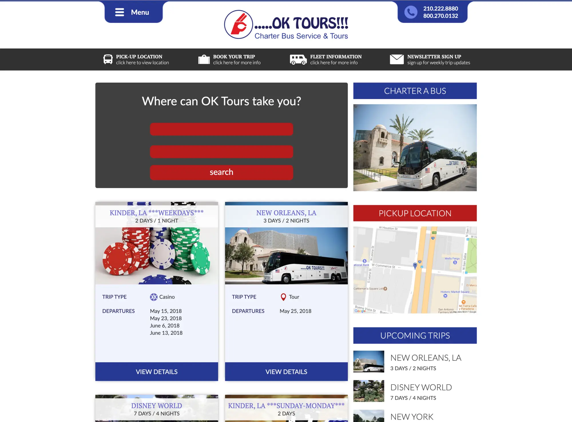
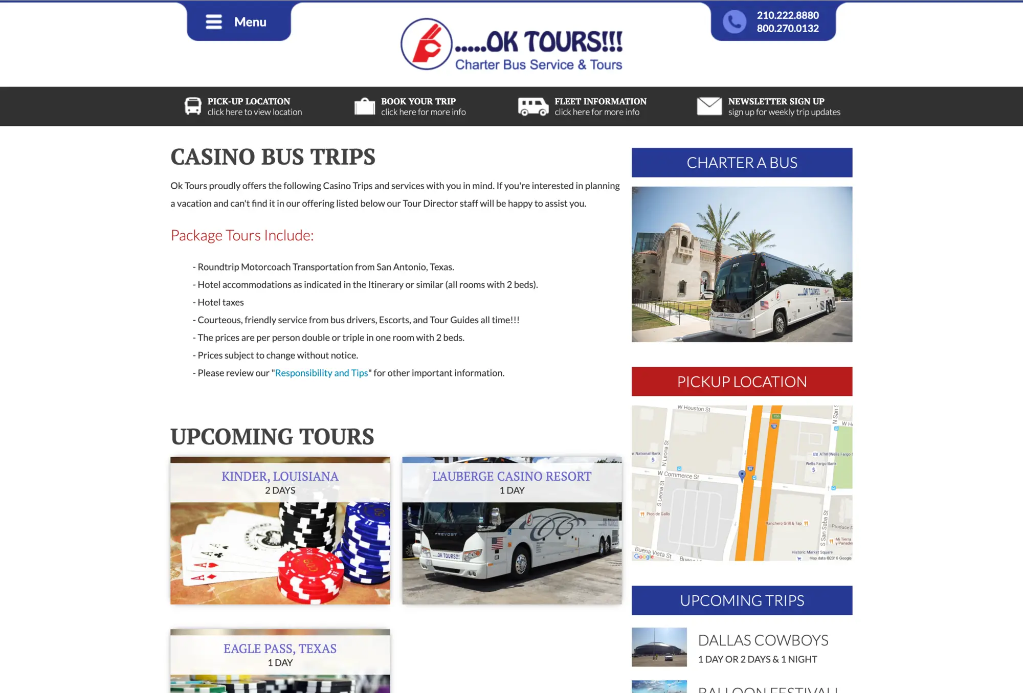
The casino bus trips page listed upcoming trips with links into the same location-page format used for standard tours. The calendar page gave users a top-level view of all departure dates across destinations, each row showing the location name, a banner image, and icons indicating whether the trip was a casino run or a standard tour. New Orleans, Disney World, Las Vegas, New York, Kinder, Eagle Pass, and other locations all appeared there. The same questionnaire from the homepage header was repeated at the top of the calendar page so users could filter down quickly.
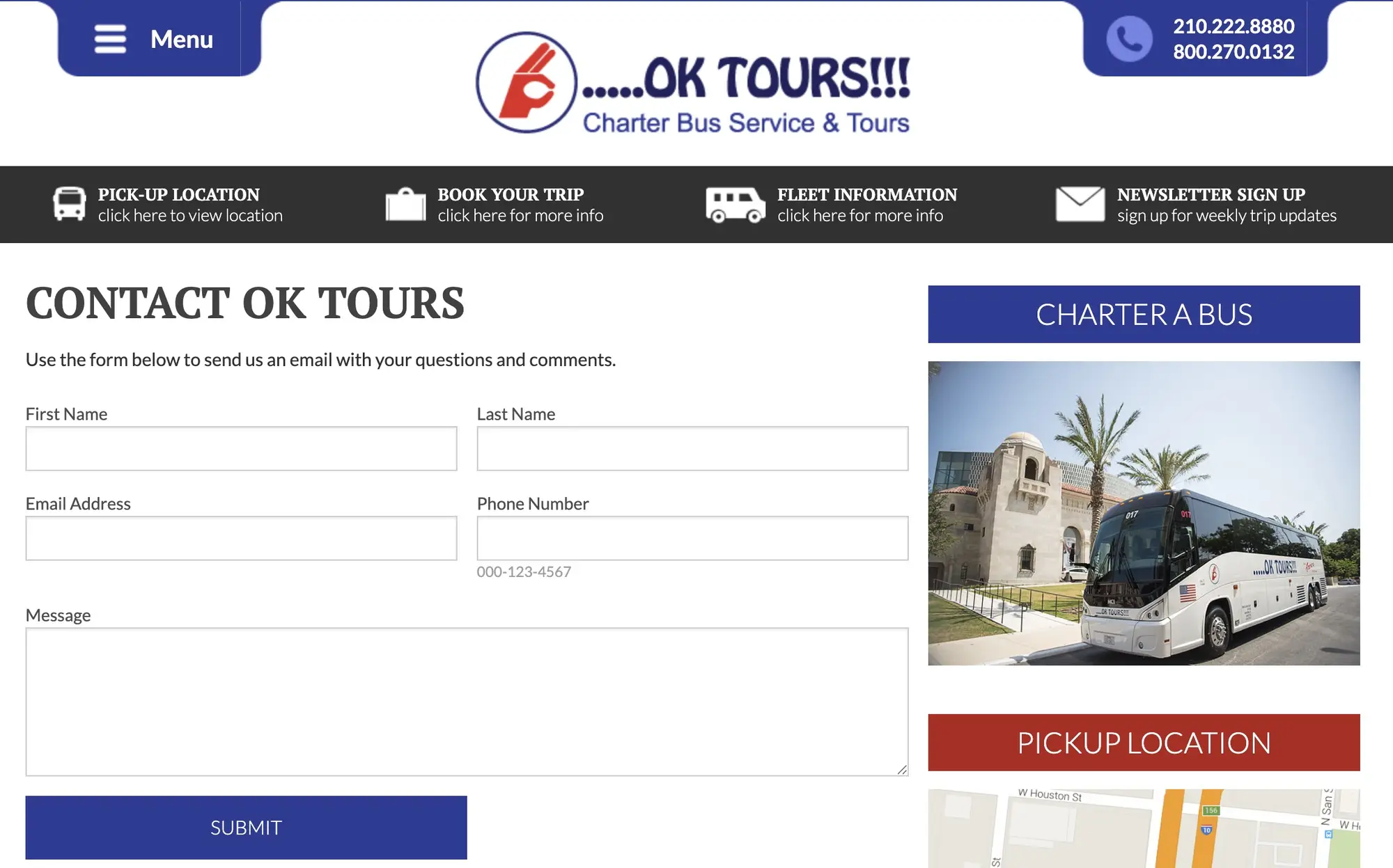
The supporting pages filled out the site cleanly. The fleet page covered the 56-passenger motor coach lineup with a photo gallery and an embedded YouTube video. About Us was copy-only. Travel tips was a standalone informational page. The contact form was built on Sitefinity’s native forms component, keeping form handling inside the CMS without a third-party dependency.
Impact: The client was vocal about the results after launch, crediting the site with a meaningful increase in tours booked. The calendar on the homepage was the piece I was most proud of shipping — a custom component built to spec, handling real content, working correctly in production.