Martin Ventures is a private equity and investment firm. The 2015 WordPress build at Gray Digital Group migrated from a site that had been static in 2014; the visual design carried forward with minimal changes, rebuilt on a WordPress theme. This was the first WordPress project I worked on at the agency, and at the time we were still working out the best patterns for a WordPress build at Gray, with no WP Rocket and no Cloudflare in the stack.
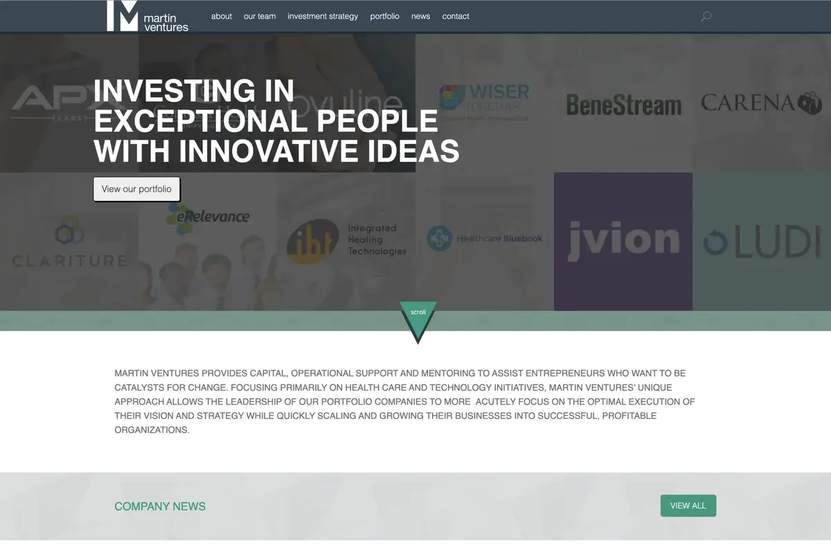
The header held the logo on the left and the primary navigation across the top, with a search icon on the far right. Clicking the icon faded the search field in; clicking outside or submitting faded it back out, a jQuery toggle pattern common to that era. The hero section below was a grid of partner and portfolio logos that cycled through randomly selected groupings, fading between sets at a timed interval. Not all of the logos were available as SVGs, so several were PNGs with transparency, which limited sharpness at larger sizes. Below the logo grid a downward-pointing arrow bounced in a CSS animation to prompt a scroll. The content below held the mission statement, followed by a company news section showing three articles with a “View All” button linking to the full news listing.
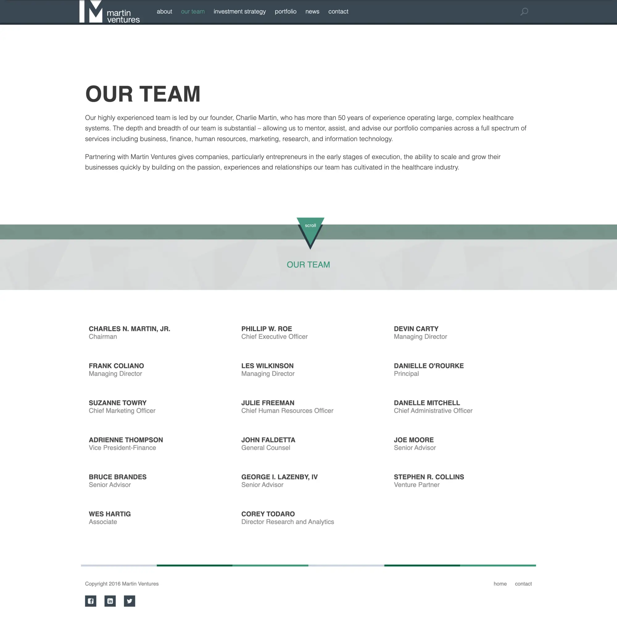
The About page was intentionally spare: a brief company statement and nothing else. The Our Team page was more involved. The page opened with a banner section showing a headline and a short statement. Below that, team members were listed in a grid. Clicking a team member triggered an anchor scroll back to the top of the page, where the banner content was replaced via JavaScript with that person’s name, title, and bio. The interaction created a deliberate up-and-down rhythm: scroll down to browse the grid, click a name, scroll back up to read the bio, scroll down again to pick the next person. The banner swap used a fade transition to replace the content in place.
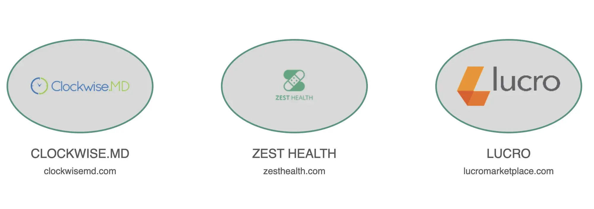
The Investment Strategy page opened with a statement at the top, the same bouncing scroll arrow below it, and then a section of oval-shaped logo tiles representing portfolio companies. Clicking a tile did not open a full-page overlay. Instead, it triggered a Remodal modal scoped to that section of the page, leaving the header and surrounding layout visible behind it. The modal pinned to the top of its section so the content was always in view when it opened. Clicking the X dismissed the modal and scrolled the user back to the tile they had clicked, preserving their position. Current Investments and Previous Investments used the same interface and behavior.
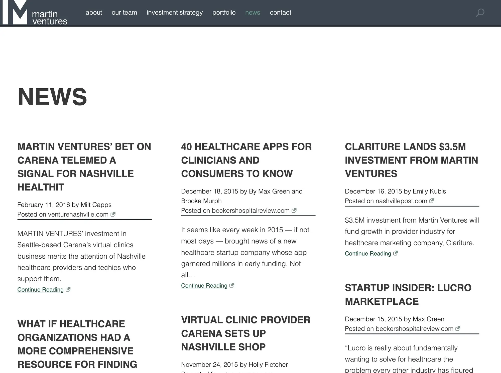
The News page used a masonry grid layout to display article cards. When Martin Ventures had previously maintained an online presence, external articles had been copied in full and republished on the site, which created copyright exposure. For this build, we moved to a summary-only format: each card showed the article title, an excerpt, the publication date, the author name, and the name of the sourcing organization, with a link out to the original. No article body was reproduced on the site.
The Contact page was a single screen with the firm’s email address and mailing address, no contact form.
Impact: The site performed reasonably well for a 2015 WordPress build without a caching layer or CDN. Looking back, accessibility was the area with the most room for improvement: the team page banner-swap gave users no visual affordance before they clicked, and the up-and-down navigation pattern added friction when comparing team members. The Remodal integration on the investment pages was a cleaner approach than a full-page overlay, but scroll restoration on slower connections could behave inconsistently. The PNG logos in the hero grid were a constraint from available client assets, not a design choice.