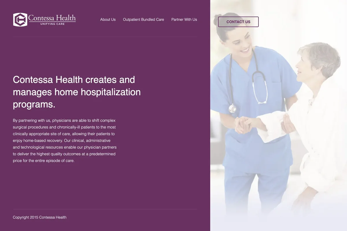
Contessa Health is a home hospitalization company that creates and manages surgical bundled care programs for physicians and health systems. I built the site at Gray Digital Group in 2015, working from Tim Smith’s design. The layout was unlike anything else in the agency’s portfolio at the time: the content column sat entirely on the left side of the page, and the right side held a single large photograph that stayed fixed as you scrolled. A “Contact Us” button sat in the top right corner of the photo column and followed the user down the page.
The homepage was intentionally minimal: logo, navigation, a mission statement, and a footer. The navigation linked to three interior pages: About Us, Outpatient Bundled Care, and Partner With Us. Each interior page opened with the same structural pattern as the homepage, a large-type statement on the left against the fixed background image on the right, before breaking into the page-specific content below.
The About Us page included an “Our Role” carousel that stepped through the company’s value proposition in three stages. Each slide had a statement on the right and a fragment of the Contessa Health logo on the left. At step one, only the center piece of the mark was visible. At step two, a second piece appeared. At step three, the full logo assembled on screen. The carousel was powered by bxSlider, a jQuery plugin that handled the slide transitions while the logo assembly effect played out across the slides.

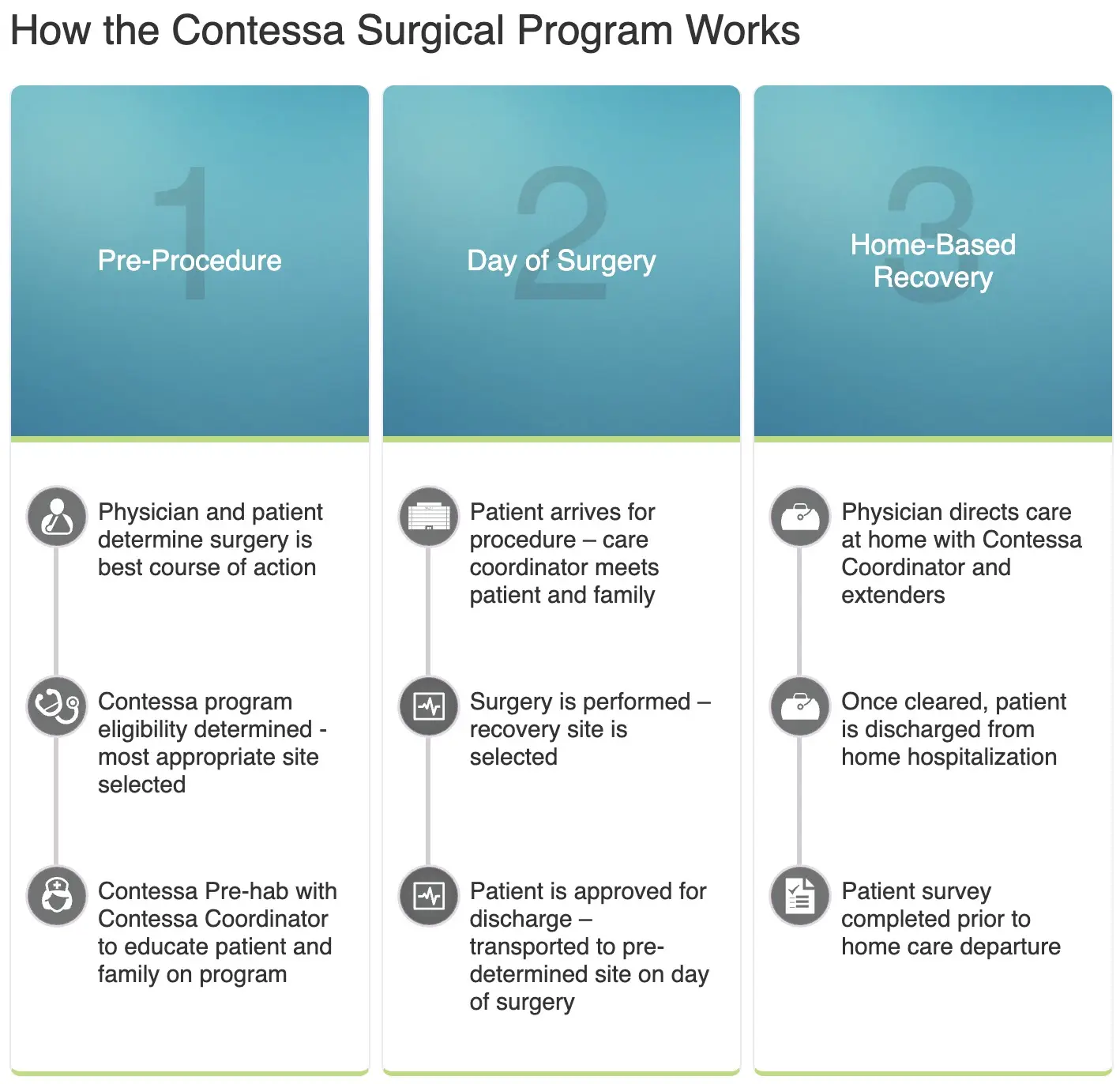
Below the carousel was “How the Contessa Surgical Program Works,” a three-column section breaking the surgical journey into Pre-Procedure, Day of Surgery, and Home-Based Recovery. Each column had a numbered teal header and a list of steps beneath it, every step paired with an inline SVG icon. Embedding the icons as inline SVG rather than raster images kept them crisp at any resolution and kept the section accessible to screen readers. This was still a relatively new approach for client work at the agency in 2015.
The Outpatient Bundled Care page included “The Complexities of Bundled Payments,” a three-step carousel walking through the major unknowns any provider or payor would face in a bundled payment arrangement. Each slide had an SVG illustration on the left and a numbered statement with supporting questions on the right, also powered by bxSlider.

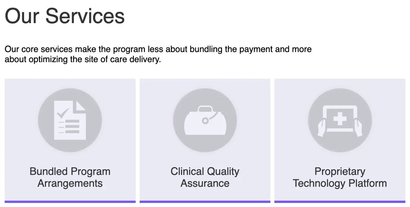
The same page housed the Our Services section, presenting three core service areas: Bundled Program Arrangements, Clinical Quality Assurance, and Proprietary Technology Platform. Each service was a large clickable card with an SVG icon in a circle. Clicking a card scrolled you down to that service’s expanded content section. At the bottom of each detail section, a button scrolled you back up to the service cards. This anchor navigation pattern let users move through the content at their own pace without losing context.
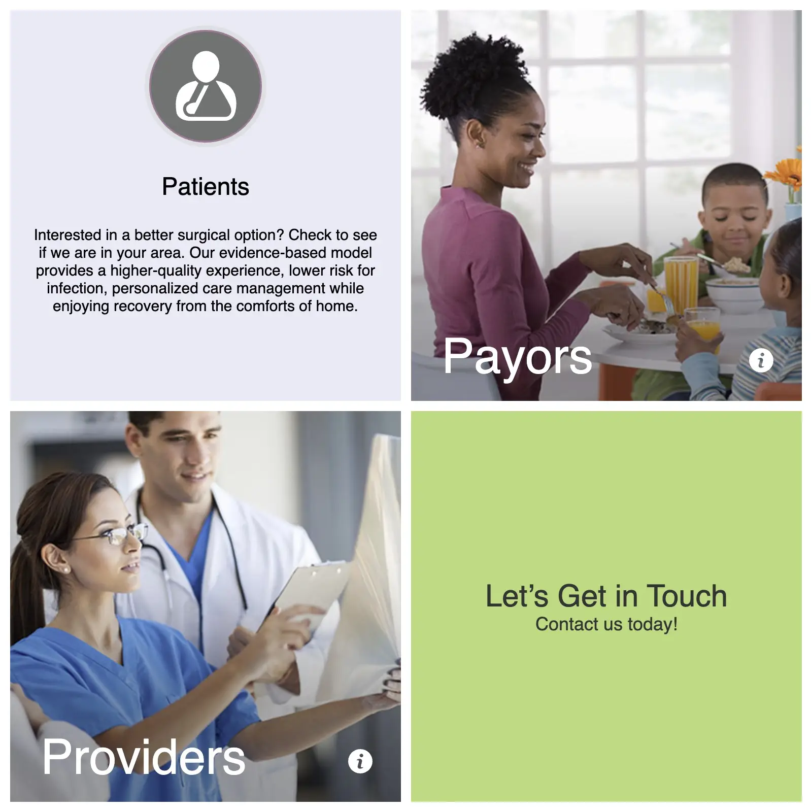
The Partner With Us page followed the same top-section pattern and then broke into a 2x2 grid of flip cards targeting four audiences: Patients, Payors, Providers, and a contact prompt. The front face of each card showed a photograph or icon with the audience label. Hovering flipped the card to reveal the message for that audience, implemented with a CSS 3D transform on the card container. The fourth card skipped the flip and linked directly to the Gravity Forms contact page. This was the first flip-card pattern built at Gray Digital Group. The whole thing lived inside the classic WordPress WYSIWYG editor, before Gutenberg existed, which required keeping the shortcode markup intact across saves.
Impact: A lean WordPress stack with no base front-end framework kept page loads under one second. All interactive sections used inline SVG for icons, keeping the markup semantic and fully accessible to screen readers. Three separate jQuery carousel and anchor-navigation patterns were built without a plugin. The flip-card component introduced a reusable CSS 3D pattern that carried forward into later Gray Digital Group projects.